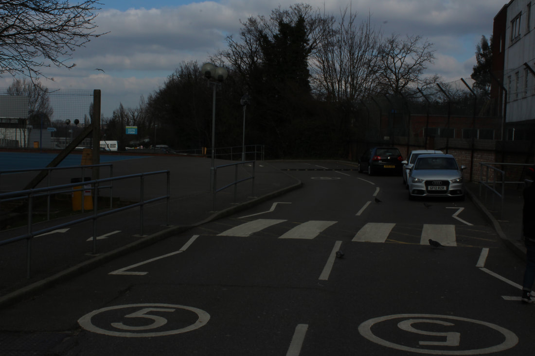
Freedom & Limitations
What will this freedom & limitations page contain?
How will he express freedom through a photograph?
What methods will be used to portray limits?
How will he express freedom through a photograph?
What methods will be used to portray limits?
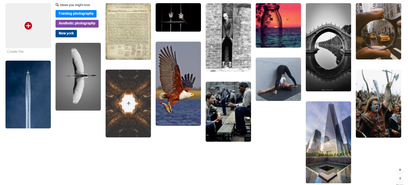
Pinterest board for unit
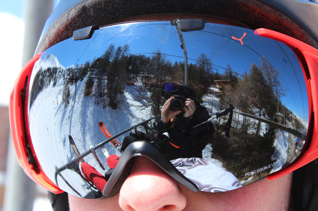
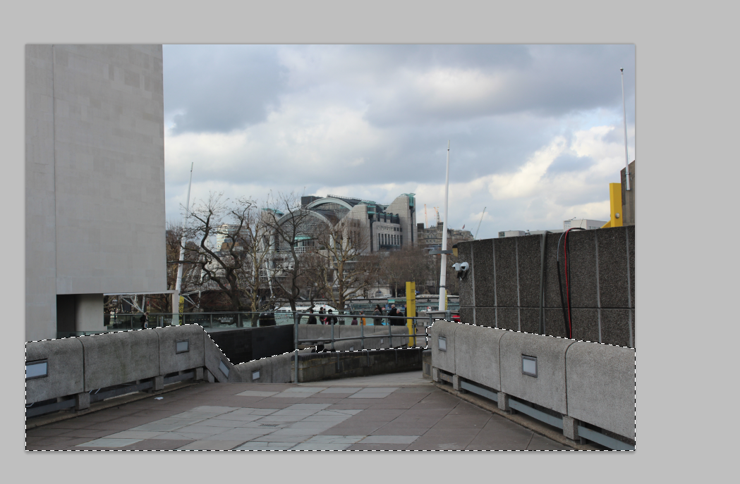
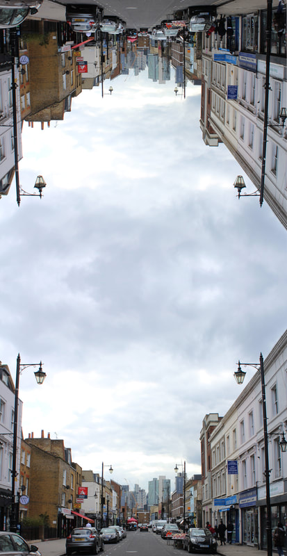
Breaking the structure
To respond to 'breaking the structure' task set, i picked an image i took of a bus moving on a low shutter speed. This image already contained the bus appearing to visually break the limits of its own structure, which i think worked perfectly. On top of this (despite my camera being able to) it could be interpreted as the limit of a camera to be able to capture such objects moving at fast speeds. To add to this, i used photoshop to drag parts of the image around to break the structure to a greater extent. I am able to make the edits much more subtle but for the purposes of 'breaking the structure' i thought it best to leave the image in such a state.
|
|
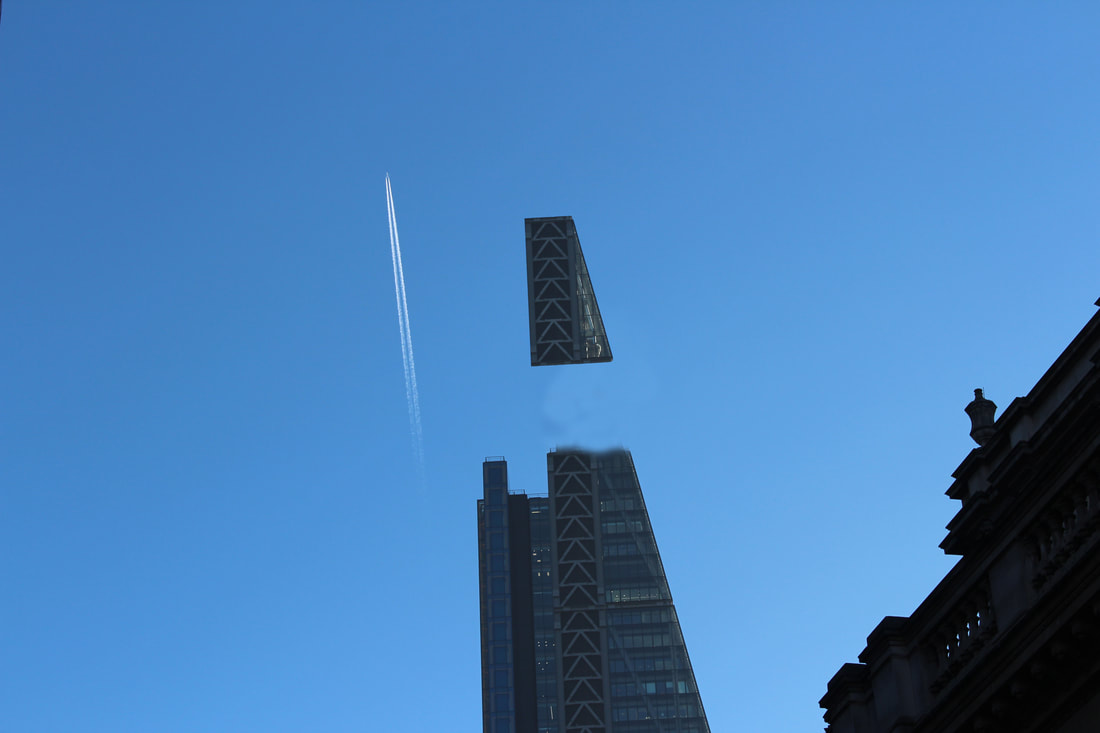
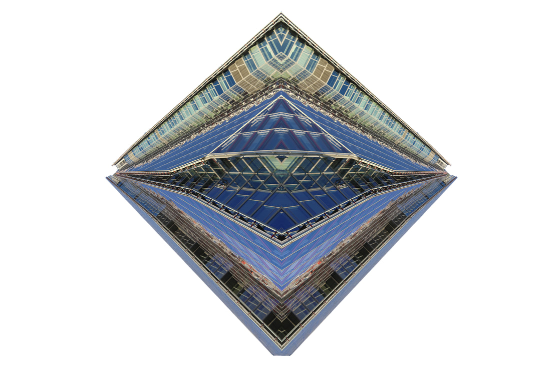
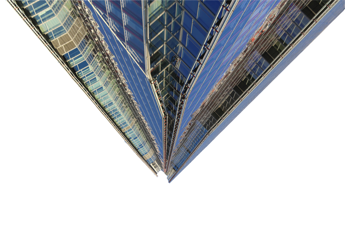
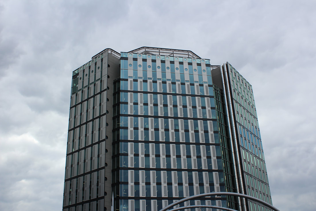
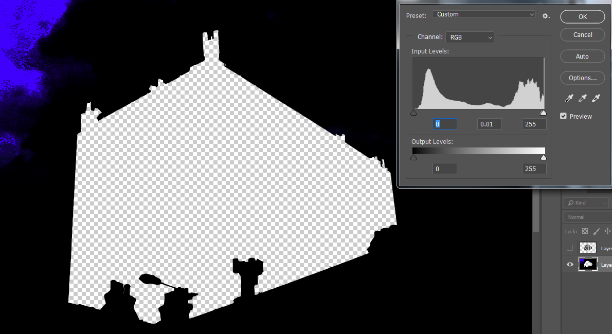
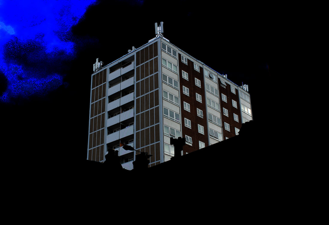
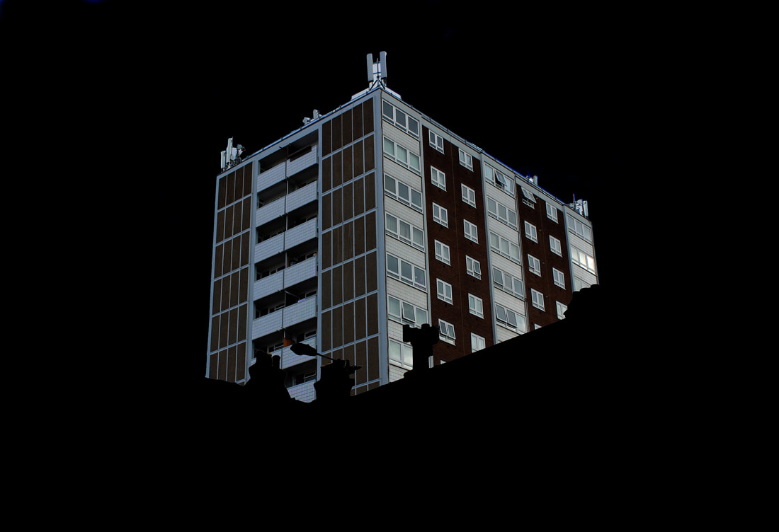
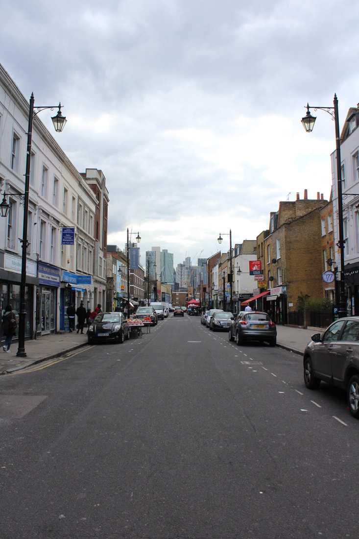
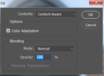
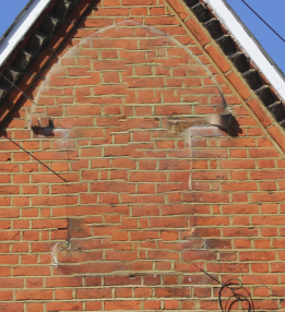
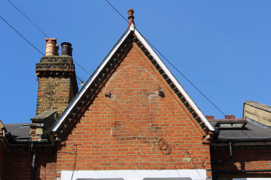
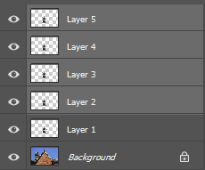
This second edit is of a building in London. It once again aims to break the limits of the buildings structure.
|
|
This small portion of my project brought interest in the breaking of images and how slight changes can affect the entire spectacle. However, I shall not be developing this as I feel more nuanced work will bring success.
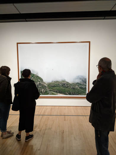
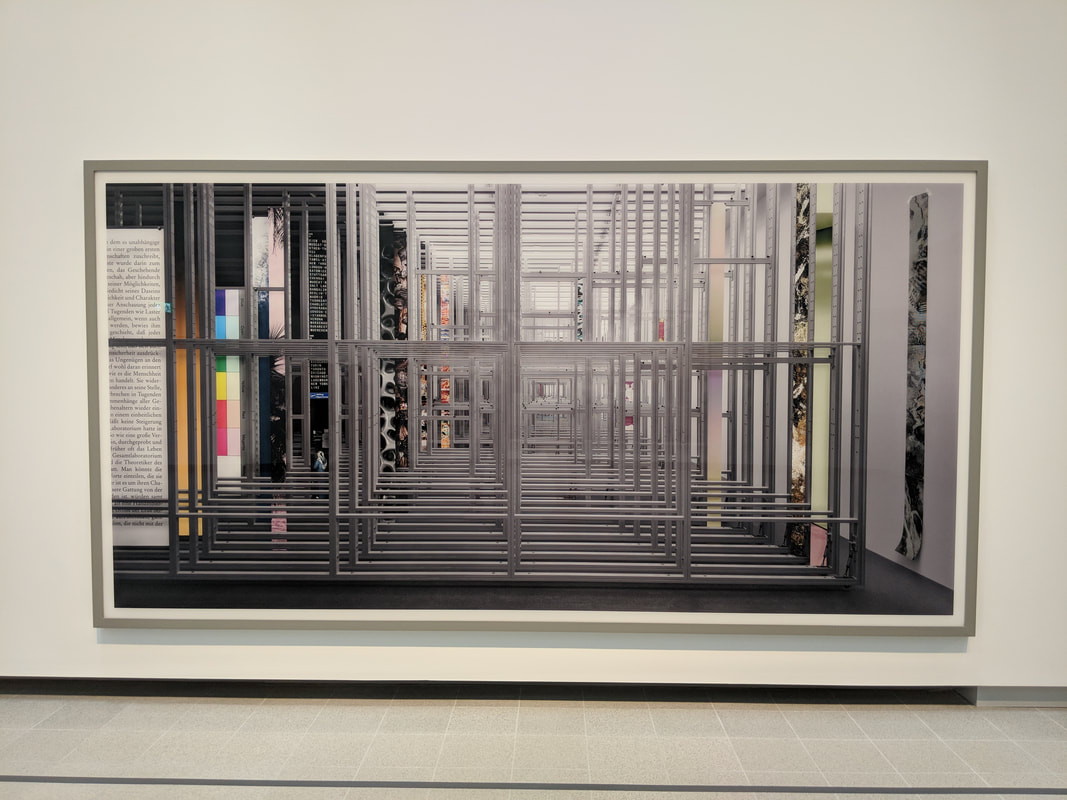
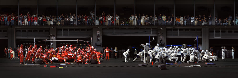
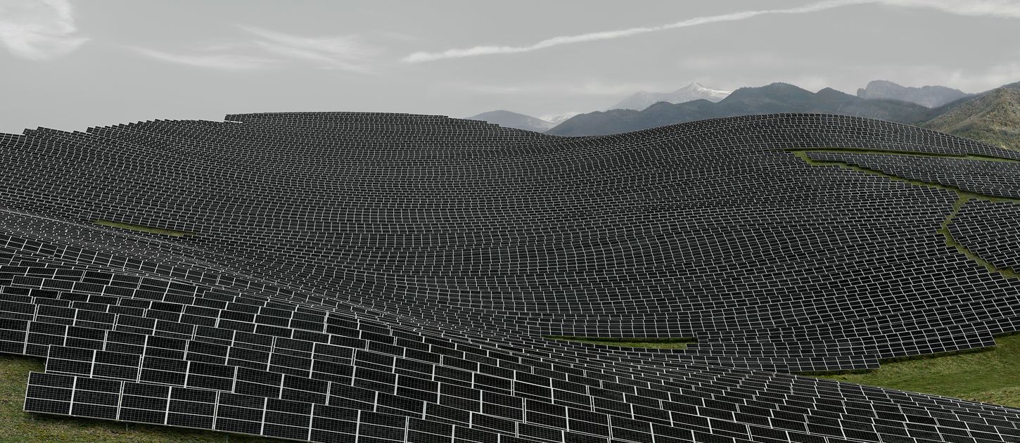
Andreas Gursky - Hayward Galley
This exhibition explored the work of Andreas Gursky. The photos consist of his work from the past four decades and most are exceptional to say the least. The images below are all of the gallery and his work.
|
|
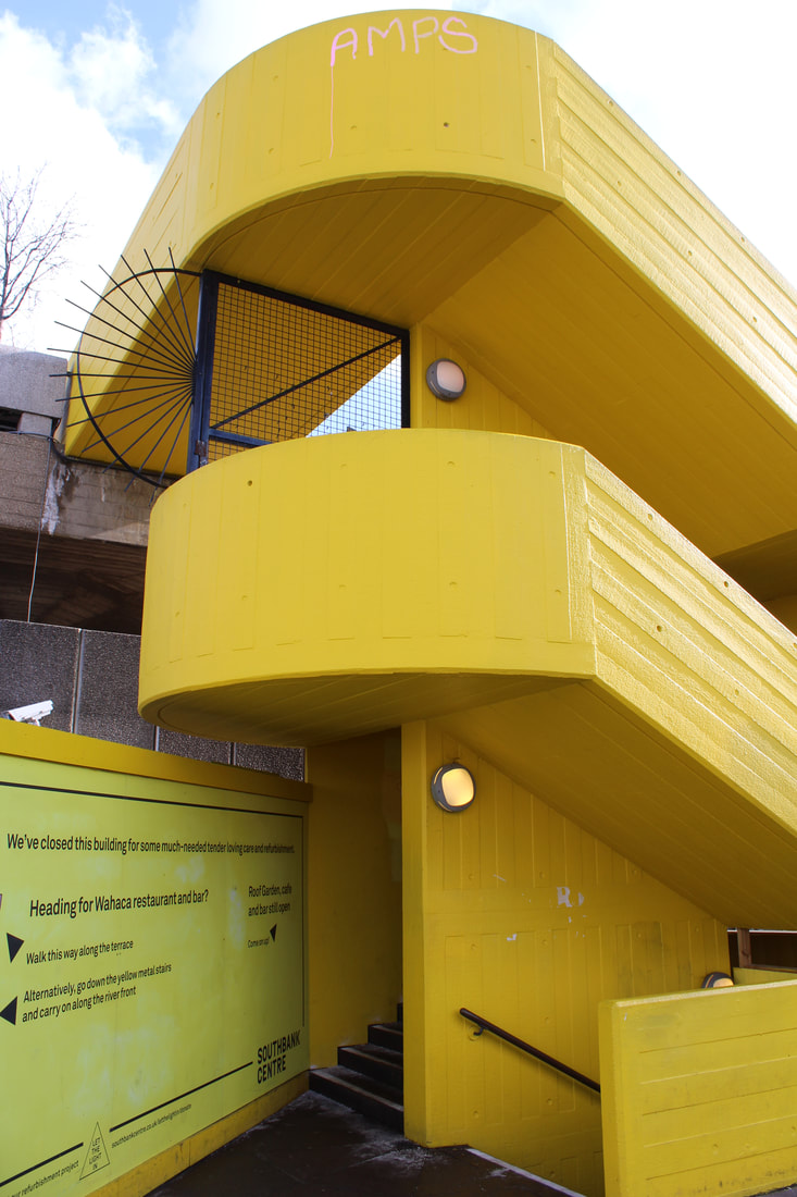
Southbank
Following my trip to the gallery, i photographed a few of the images inside and also along the south bank. I really liked the bright yellows of the stairs. I pictured an opportunity to use colour to manipulate the image. I shall see how this idea maps out soon. I identified the isolation of colour in some of the images and liked this.
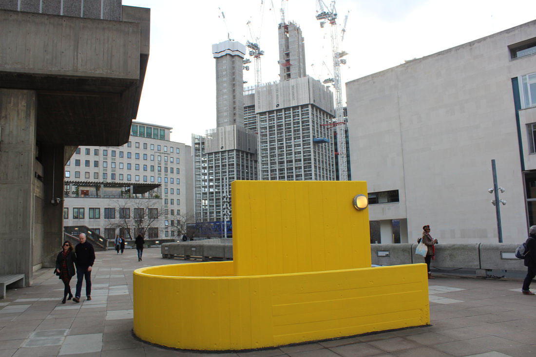
Editing the 'yellow boat'
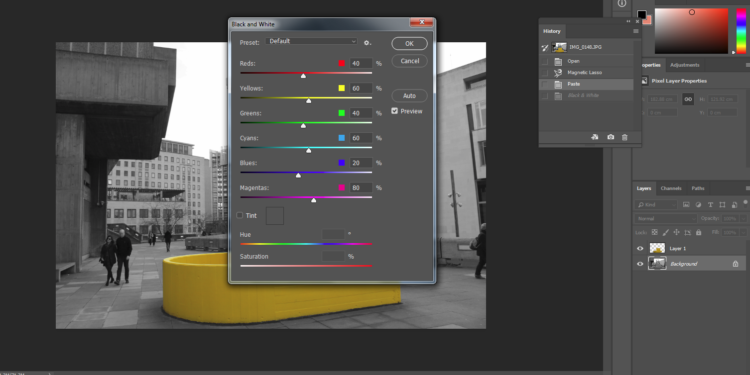
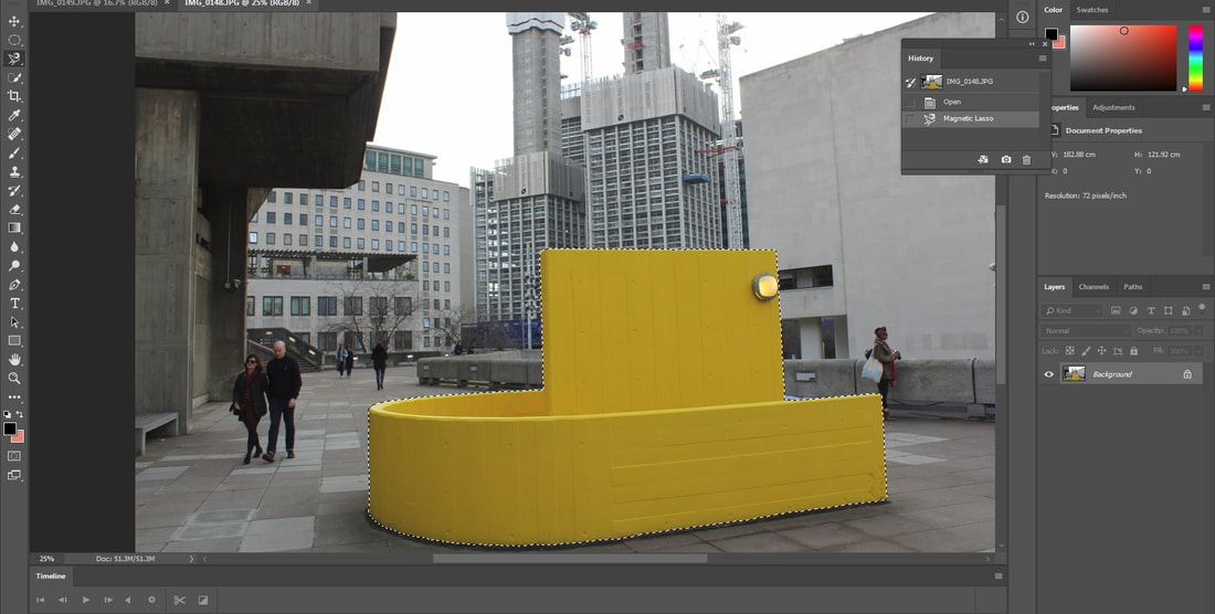
The second image containing yellow really stands out to the eye. This is due to the yellow boat shaped object in the foreground. The colour away from this boat is almost non existent and I interpreted this as the yellow and colour being trapped inside this object. My first idea with this image was to select all the yellow, copy it and put the original background as black and white.
|
|
The changes were subtle but pleasing. Compared to the original image, the change in the backgrounds colour is very minimal which supports my original interpretation of the image.
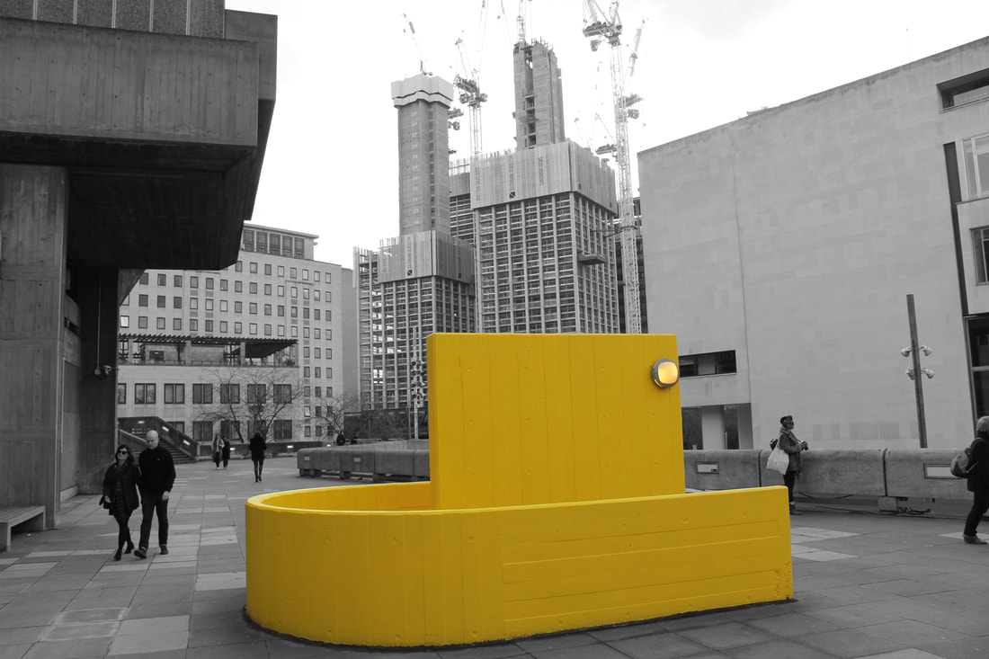
I enjoyed editing and separating out the colour of the picture. I think i will use this method going forward but to a greater extent/differently.
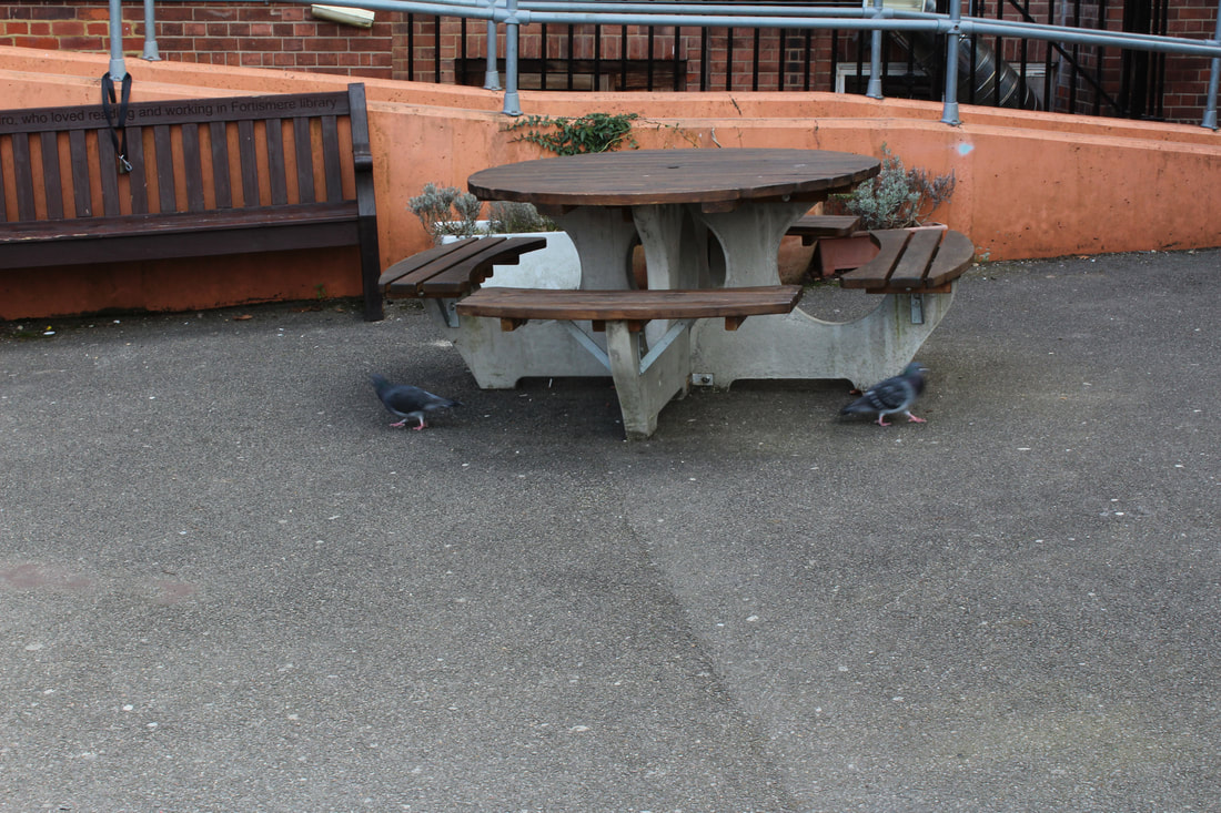
Set Tasks
Intentions of the task, link to the exam theme. This is several tasks. How are you going to distinguish between them?
|
|
Here I challenged the freedoms and limitations of a photograph. The images are basic but are affected by changes in focus and exposure. How do you interpret their differences. Through the change in light, mood, atmosphere.
|
|
|
|
|
|
|
|
|
|
|
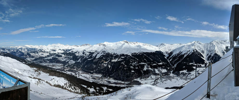
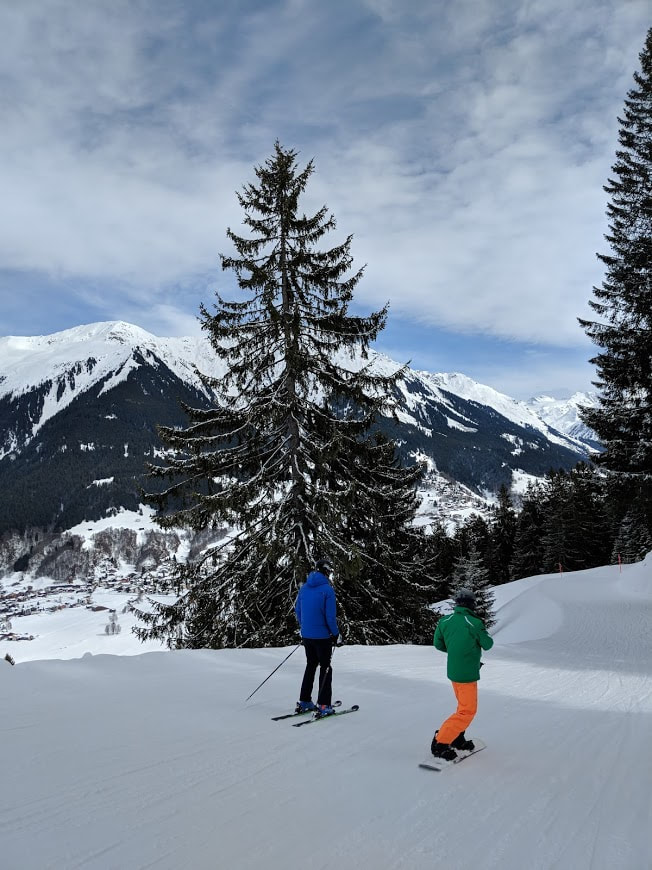
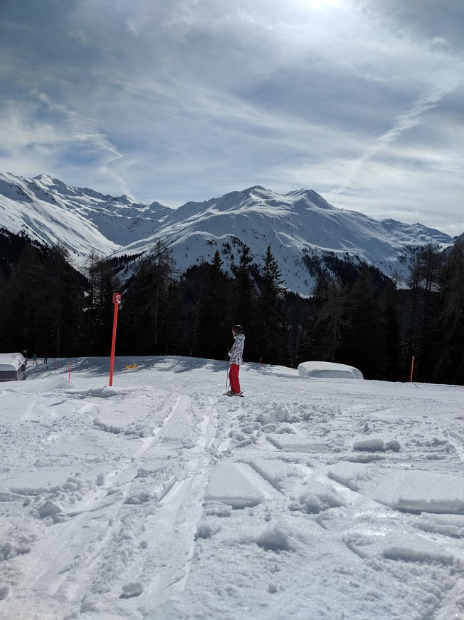
Strand 1: Heights
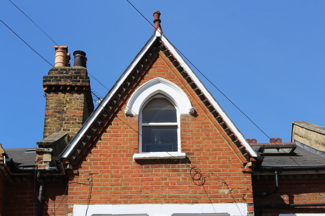
Although highgly publicised and known, I took inspiration from the great Ansel Adams for his landscape pictures and those of mountains. His most prominent work is in black and white. Despite this (i say despite but black and white photos are arguably more powerful) they are unbelievable, even today. He uses methods of light to take his photos. He measured how much each area should be subjected to and the different levels of black, grey and white in his images. He captures the scale of height without being atop the highest mountain. For this, I took inspiration from Adams.
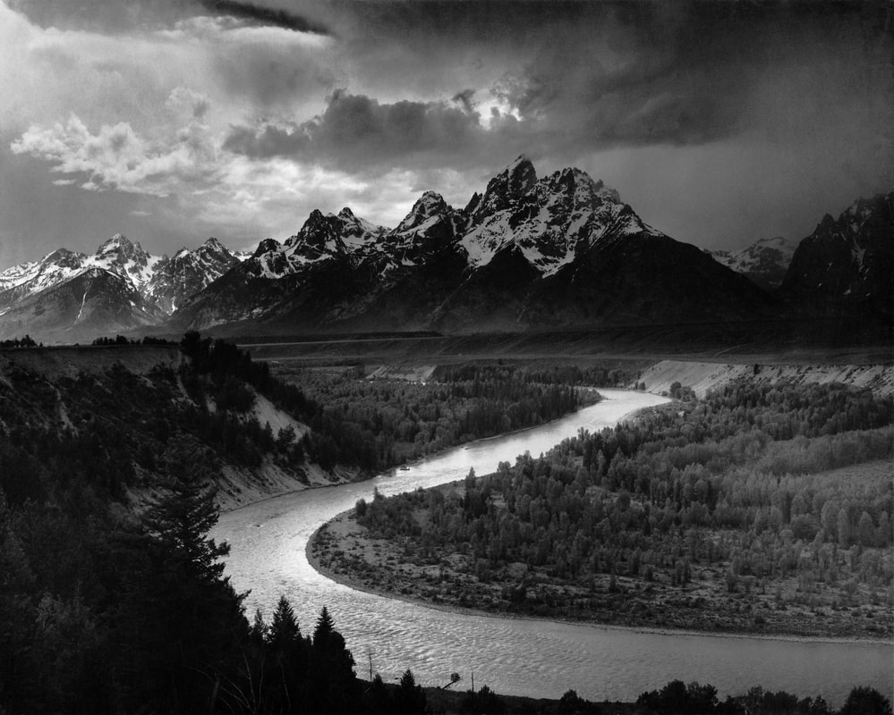
|
|
For thousands of years humans were unable to explore and survive in abject conditions such as up mountains and in cold areas. Today this is quite a different reality and our once limitations have been broken down. Freedom to choose my work at last.
|
|
|
|
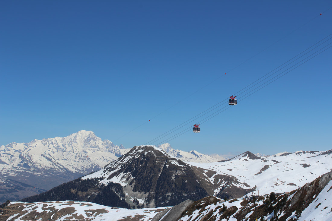
These images were great. I enjoyed taking and creating them. I found a new perspective on photography and it's limits while atop a mountain. However the logistics of continuing the project forward were not reasonable. Due to this I shan't be continuing it and diverting back to the isolation of colour and its freedoms/limits.
Further isolation of colour
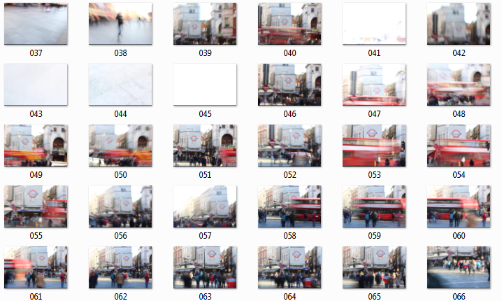
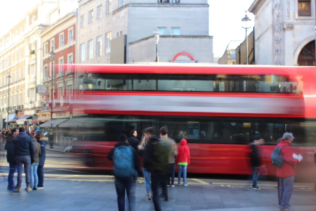
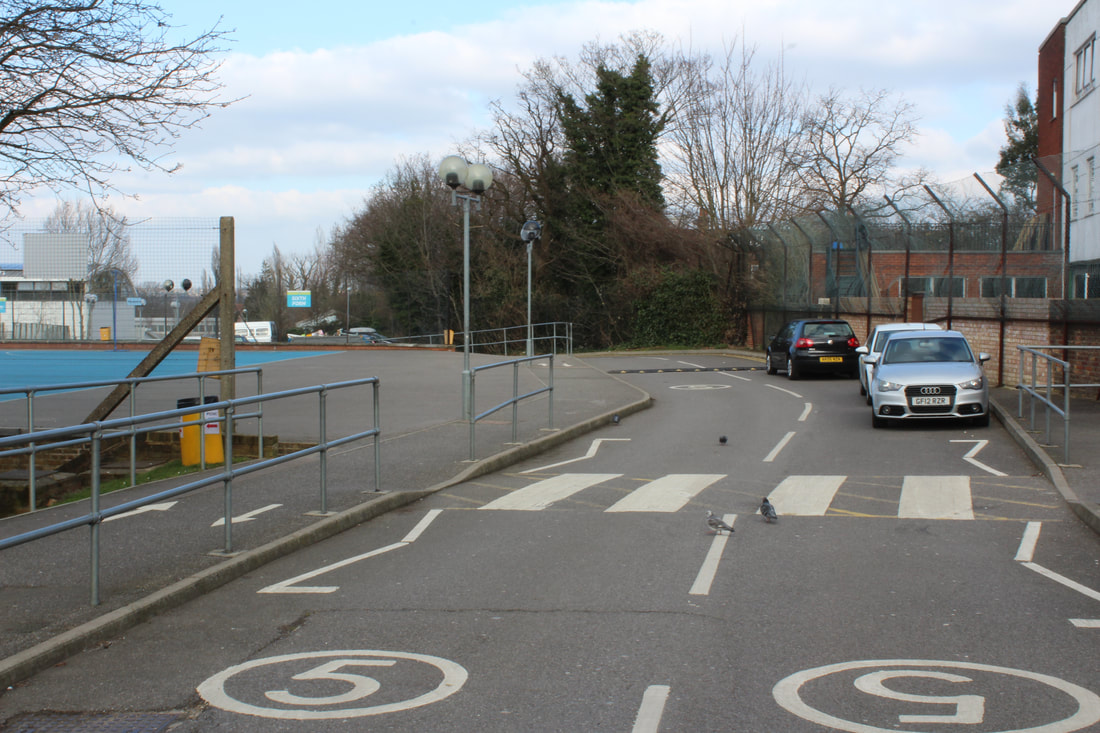
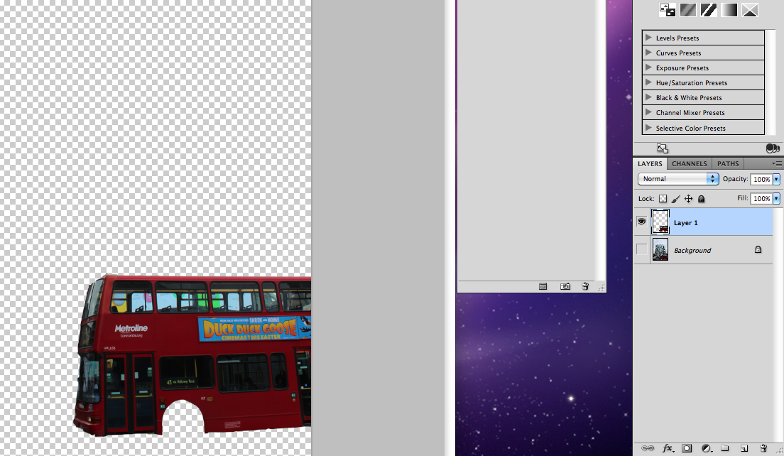
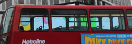
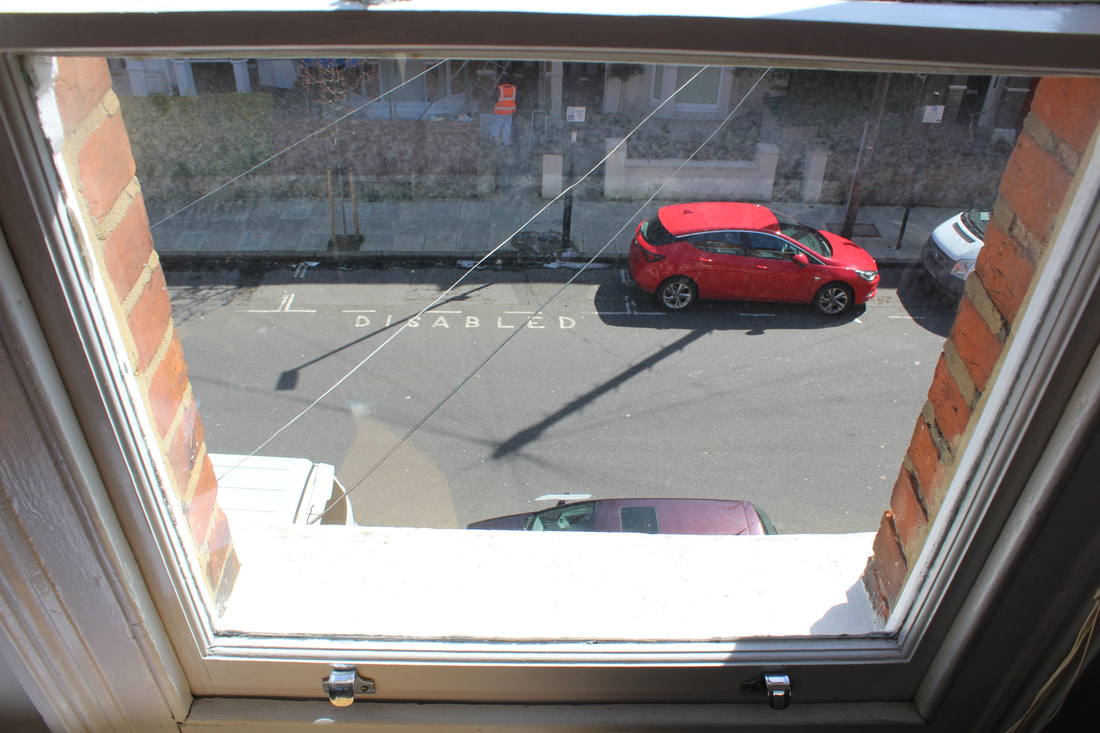
Following the theme of isolation, i decided to further explore the idea of colour isolation. While out in central London I saw a photo opportunity with the bus as shown below. In hindsight, i would have preferred the framing of the photo to be better and with the whole bus in shot. But hey, it works as is.
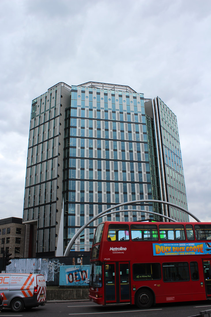
To start with the editing, i selected the area of the photo in which only the bus is present. THis was then set into its own layer to allow editing of the rest of the photo.
|
|
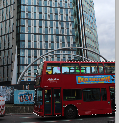
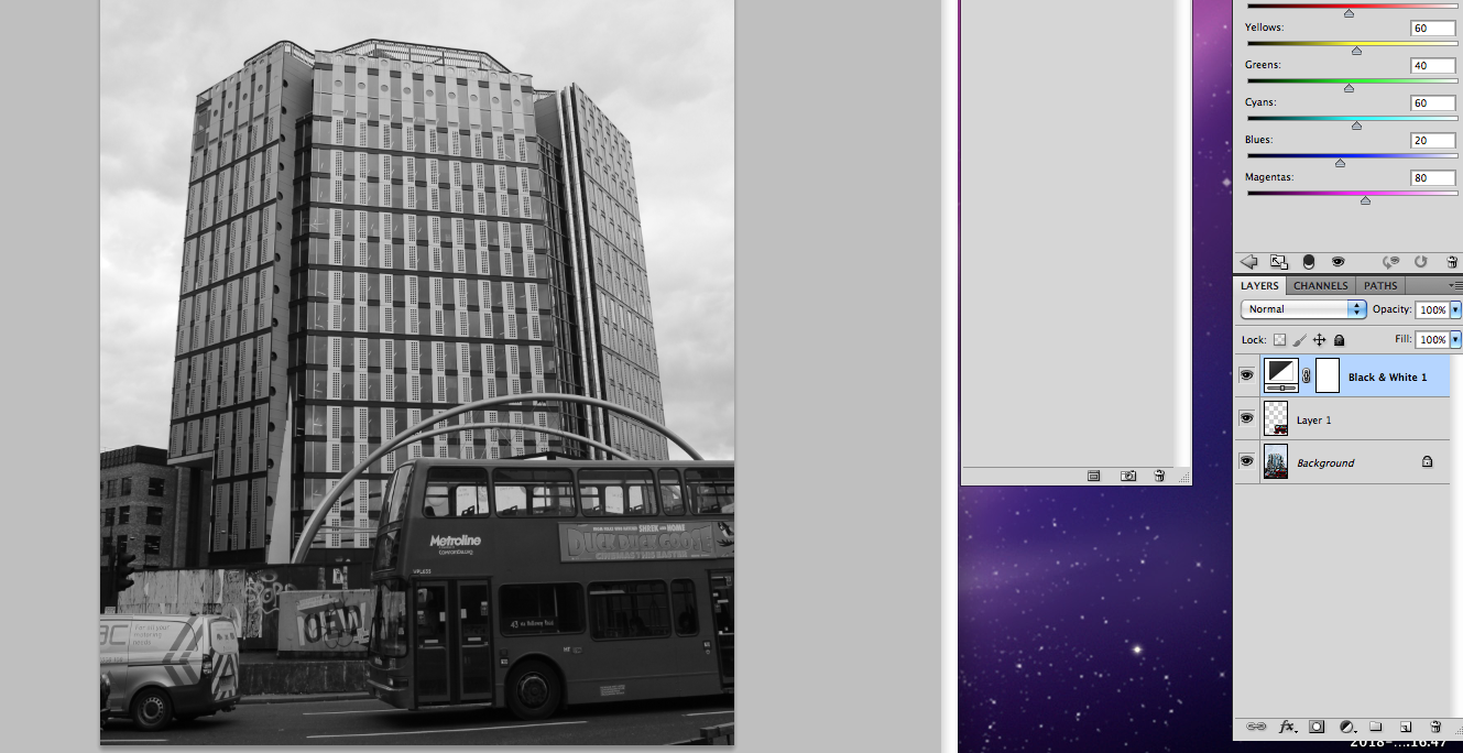
Going along with the theme of colour isolation, I used a black and white filter over the image. I then moved the layer containing the bus above the filter. This means that the bus is in colour and the rest of the photo not.
|
|
|
|
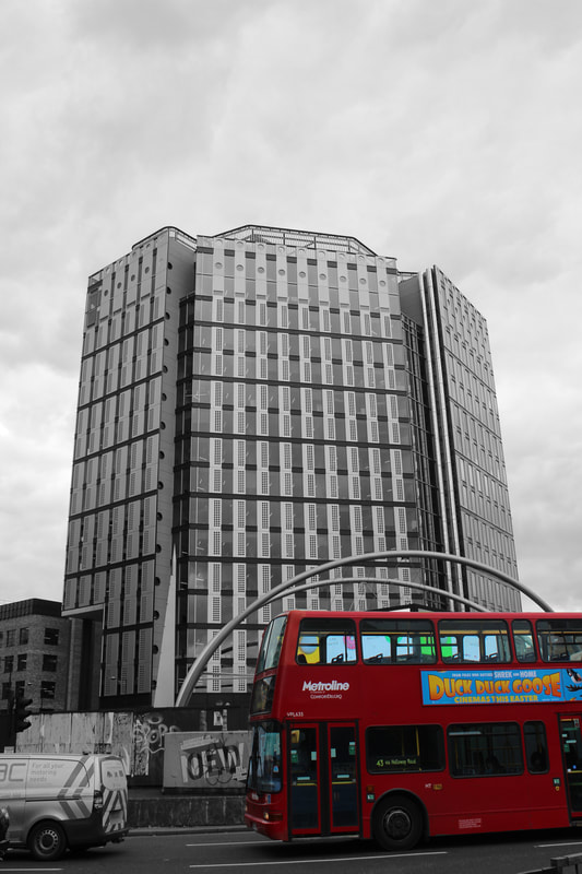
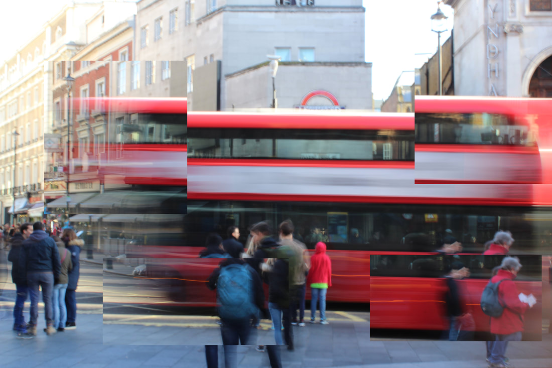
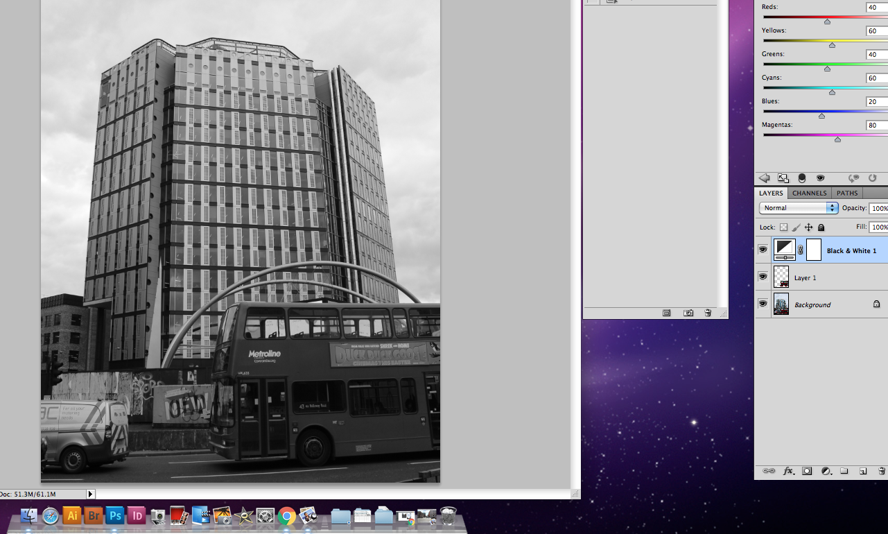
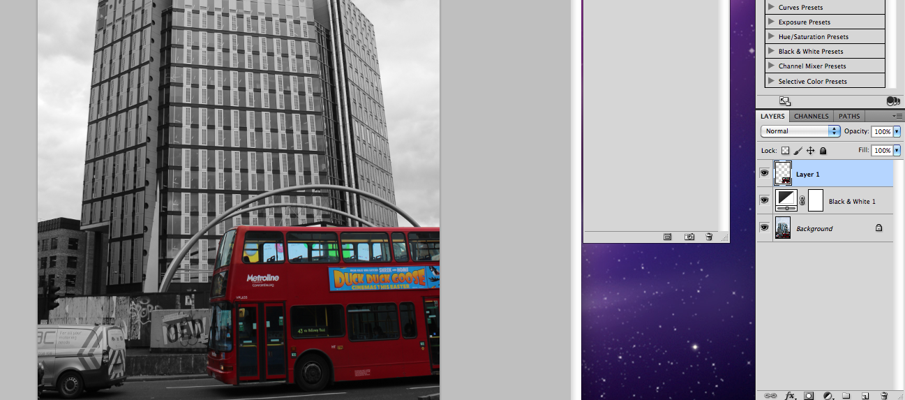
After creating the image above, i felt that more could be done to highlight the isolation and lack of elsewhere, colour. I noticed that behind the windows of the bus was a colourful poster. I did the same with the windows as i did for the whole bus earlier. The results show below.
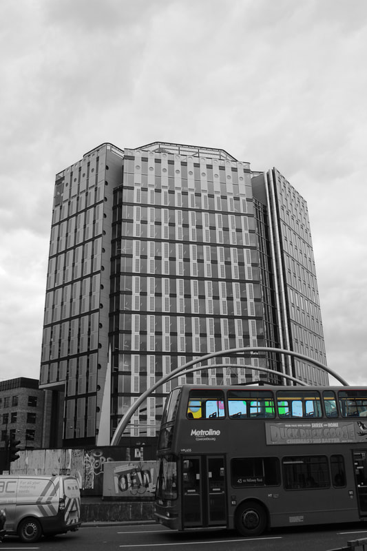
I really liked the extent to which i was able to isolate the colour in these images. The trapped colour really shows off the idea of a lack of freedom for me. I think I shall try and continue on this theme further on in the project. Whether this isolation comes in the form of colour, I am not certain.
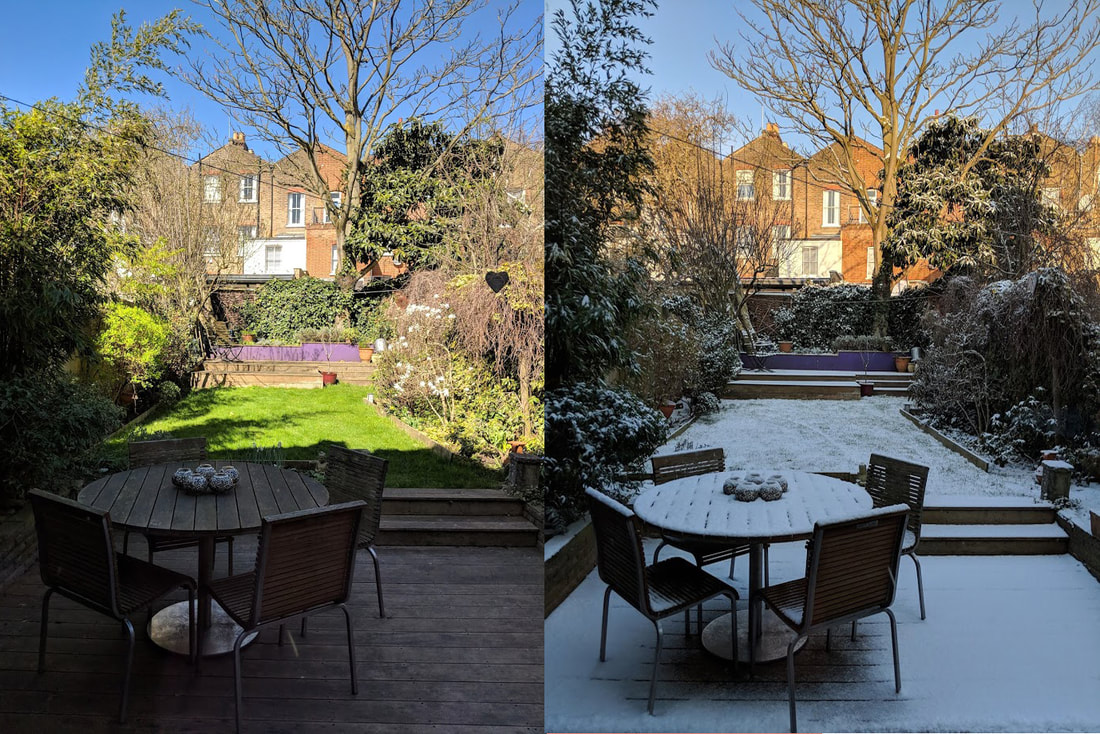
Strand 2: weather limits
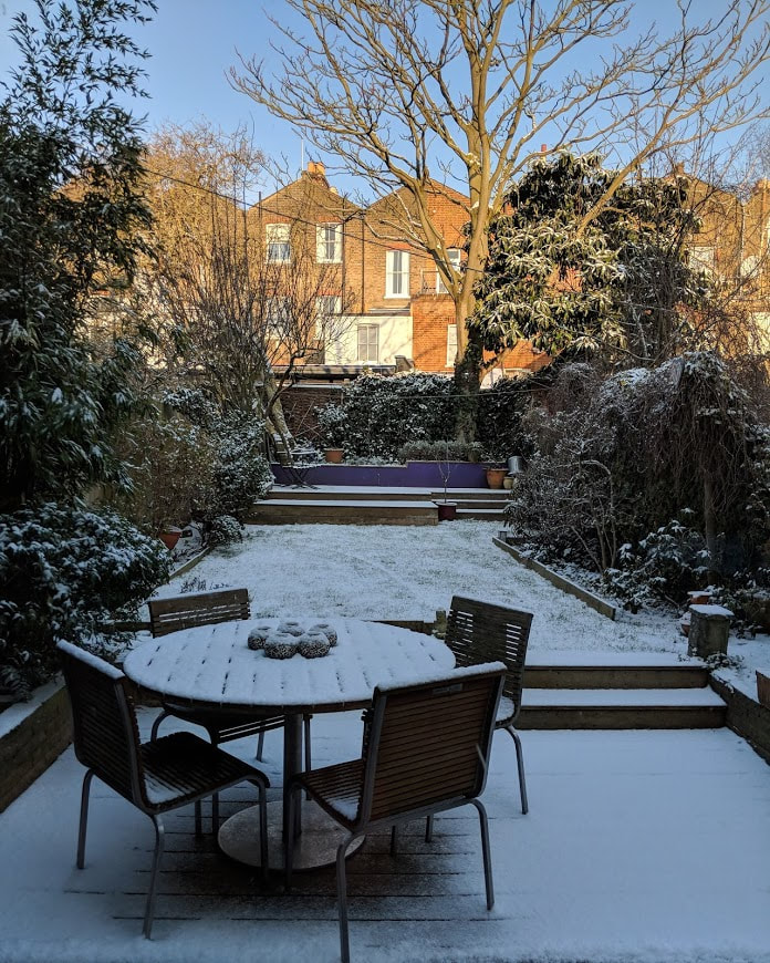
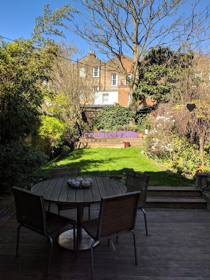
Over the winter and early spring, many different types of weather can be seen. The winter of 2017/18 brought much more snow than in the years beforehand. I decided this had to be taken advantage of for my project.
Looking out my back window, the effects of the snow are hugely prominent. What is most noticeable in the photo however, is the contrast between the snow in the foreground and the sun in the back. This gives the idea that there is a limit of weather.
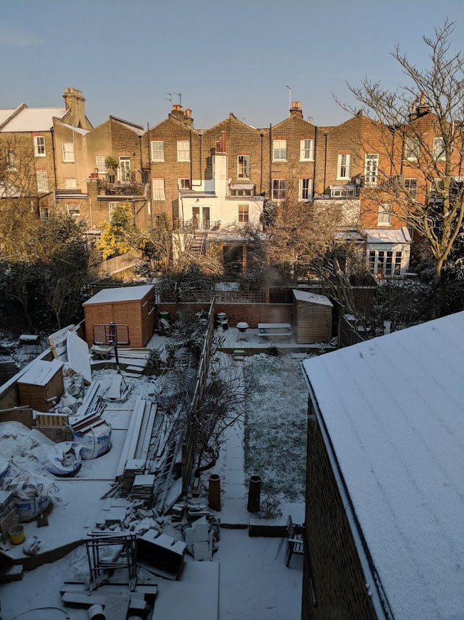
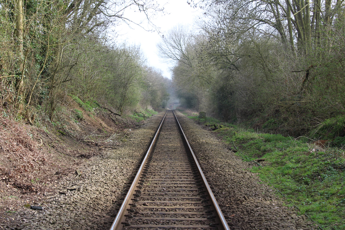
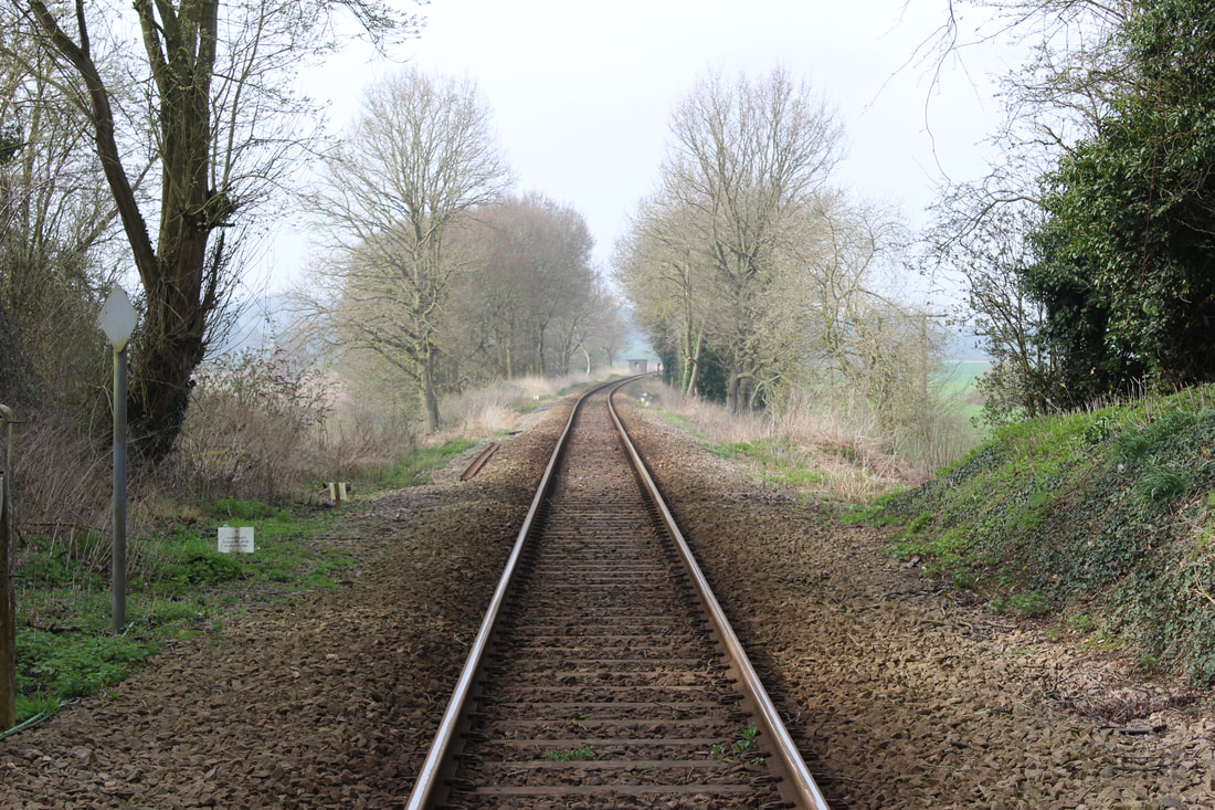
Below, two almost identical images of my garden are shown. The first, the 28th Feb. The second, the 5th April.
These two images show how in just over a month, how drastically the weather can change. Although putting these two images next to each other would have been effective, I thought it important to keep them large and visible too.
These two images show how in just over a month, how drastically the weather can change. Although putting these two images next to each other would have been effective, I thought it important to keep them large and visible too.
I finished this small strand on weather relatively quickly. Despite it's short lived time, I found the images very rewarding to create. The changes to the foreground and garden are very interesting. I doubt I will take this further.
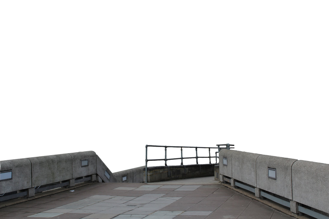
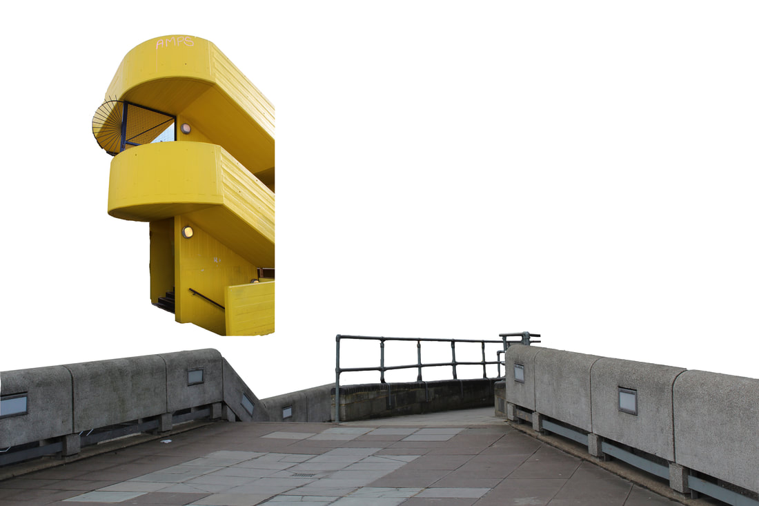
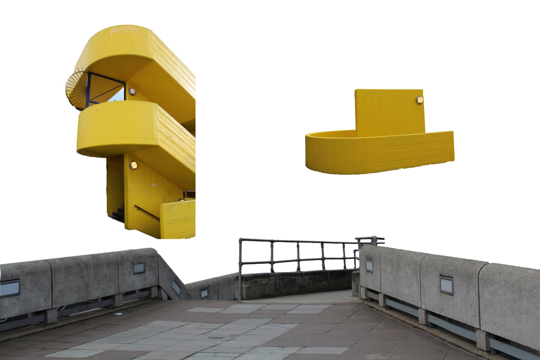
Strand 3: Singularity
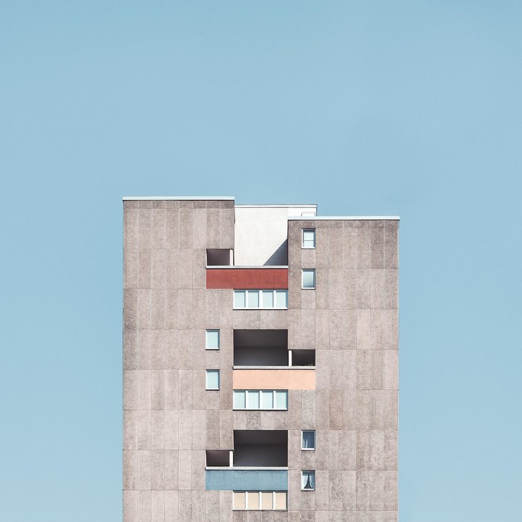
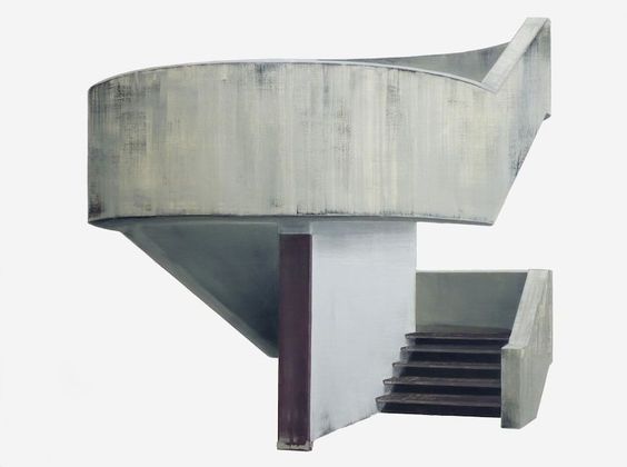
Following my previous work highlighting colour and its limits in architecture, I found the work of Patrick Cornillet and Maite Brandenburg very inspiring, These two artists isolate pieces of architecture . I assume they use photoshop to isolate pieces of an image, then further editing after doing so. This turns the subjects of the image into shapes rather than architecture. This is clearly shown below. To the eye, the stairs come from nowhere, to nowhere. This changes everything about the image. The same is present of the tower block. I think the windows have been edited, hence their locations. The final image is spectacular. Each individual window was edited with a different colour and feature. This image is beautiful. I am writing this far into the future after using it for inspiration but the potential is unlimited.
|
|
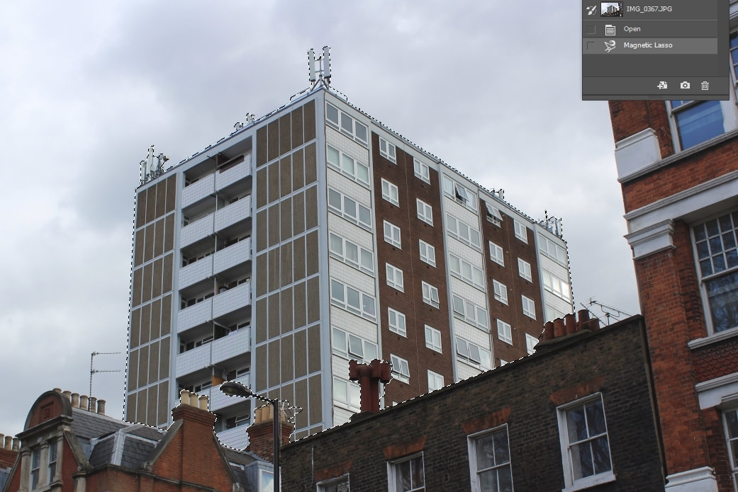
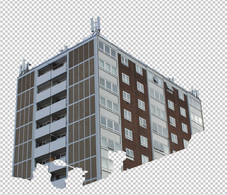
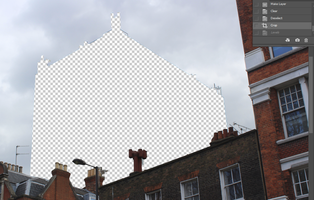
The first step with these images is to select those areas in which I want to be copied into a new layer. I did this in the first image as shown with the magnetic lasso tool (my favourite photoshop tool). After doing this, I found areas showing the people and river were still present. To remove these I used the eraser tool. After i was finished, i decided to add the yellow stairs and boat to the background. This creates an odd image.
|
|
|
|
|
|
|

I really liked creating the subject above. The surreal effects are very powerful and I am definitively going to take this process forward. This process was already familiar to me.
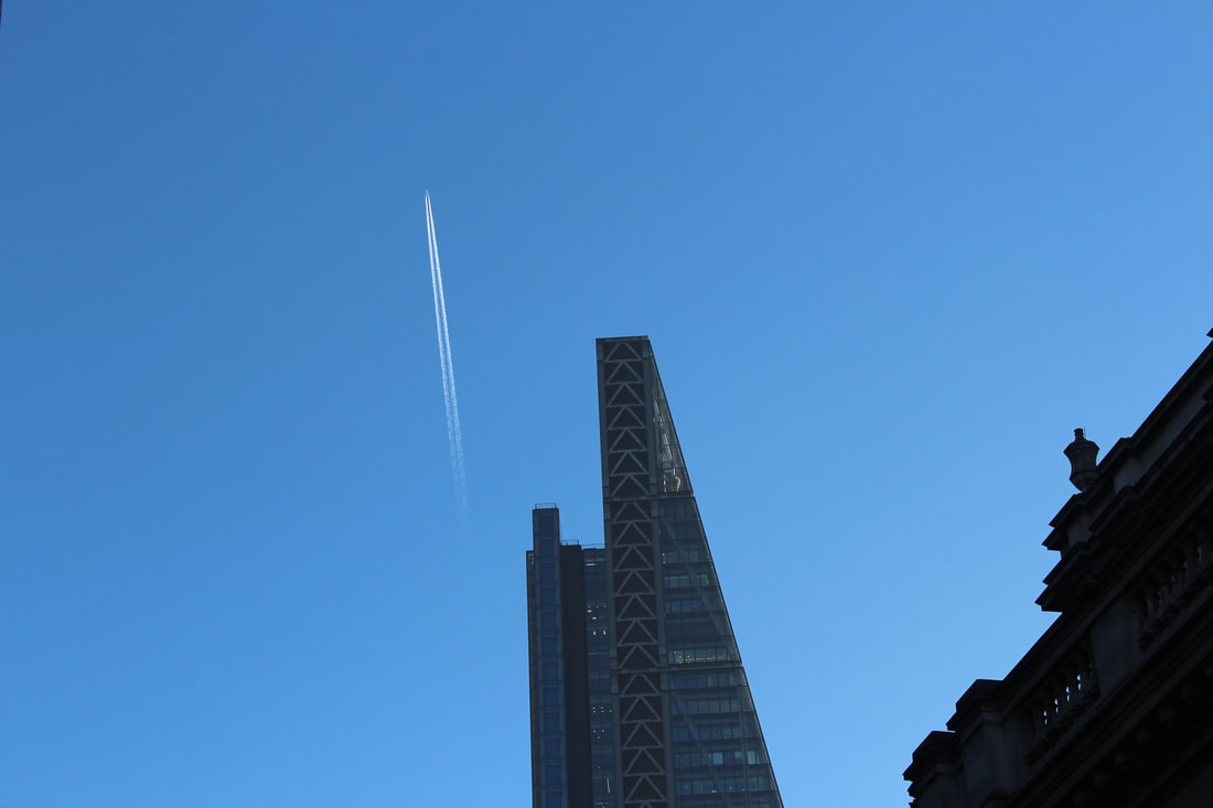
Edited buildings
Following the editing and singling out of individual items and architecture, i decided to edit some images i took of buildings in central London in a similar fashion. The process was the same as before, I have left in some of the editing steps but less as it has been previously covered.
|
|

|
|
|
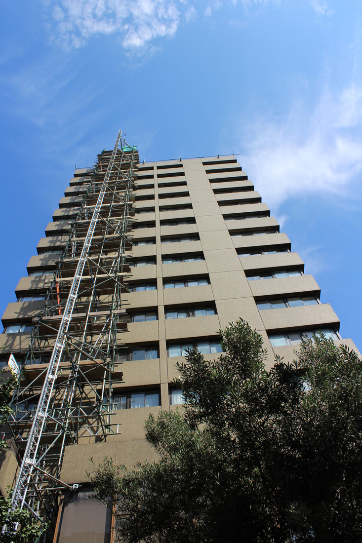
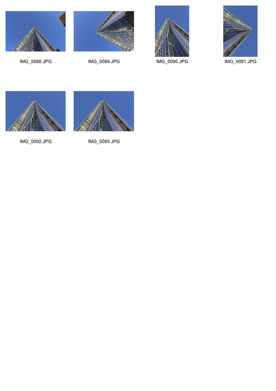
The shard
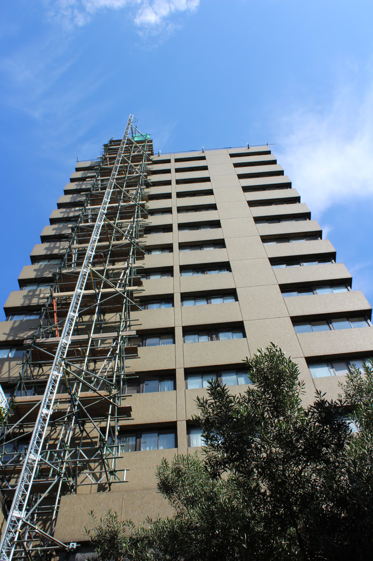
Next, the shard. I took a photo from the bottom of the structure to have a great imposing feeling upon the viewer. This really shows the individual how small they are in comparison to the great structures we create.
|
|
This process is almost identical to that before. I enjoyed creating the images above but they are boring. I need a much bigger subject with more editing steps to be more gratifying to create.
Something that i really began to focus on following the shard pictures were how imposing the windows were and how they affected my photography. Due to this, I went out photographing in central London again. I looked for buildings in which many windows were prominent. Below are my shots from the day.
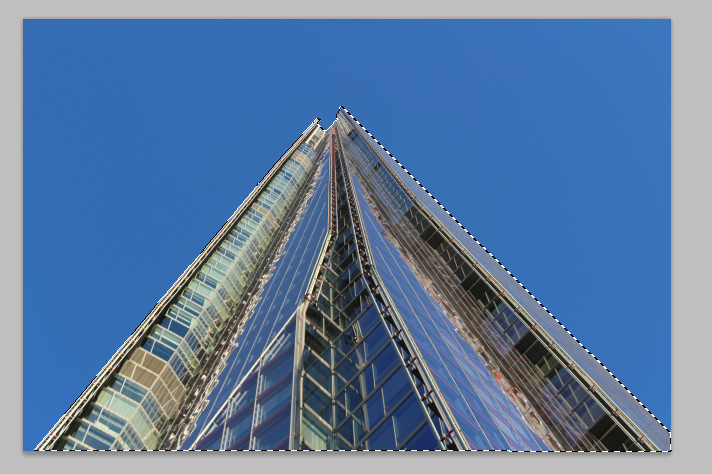
Of all the images, these two stood out the most in comparison to the others. I decided to edit the one on the left first.
|
|
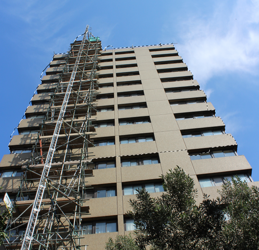
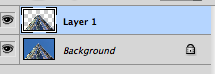
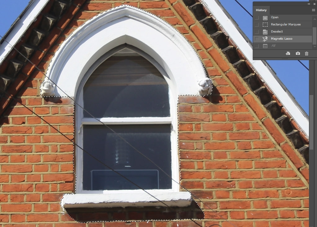
My first step, as before, was to select all that I wish to stay the same in the image after i was done editing. I used the magnetic lasso tool to do so. Arguably my favourite and most used tool on Photoshop.
|
|
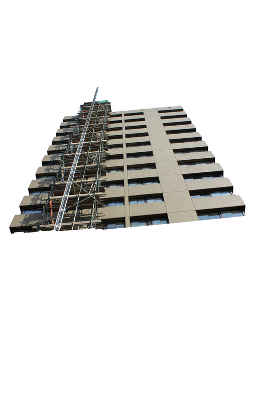
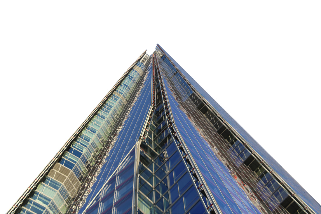
To truly make the building stand out, I used the 'levels' tool in adjustments. I darkened all that from the background that had not been edited. This really made the area in which the building was located stand out further.
|
|
I decided that I didn't like the feature of colour at the top left. To rectify this issue, I decided to clone stamp from the black areas around the image and paste onto the blue area.
|
|
Chosen strand: 2&3
“Who wants windows?” Mr Twit had said when they were building it. “Who wants every Tom, Dick and Harry peeping in to see what you’re doing?”
|
|
Following my work on isolating buildings and colour, I decided that a single strand development from my work did not fit well. Going forward strand 2&3 will be combined through the isolation of colour in buildings and primarily windows.
|
Although i took inspiration from the work of Roald Dahl and Quentin Blake, it is also important that I take inspiration from real photographers. So I stumbled across the work of a woman named Ilaria Bombelli. Here she documents life out of her window. This really inspired me to document life out my window too!!
http://moussemagazine.it/life-from-my-window-laura-bulian-gallery-ilaria-bombelli-2017-2018/ |
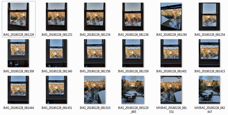
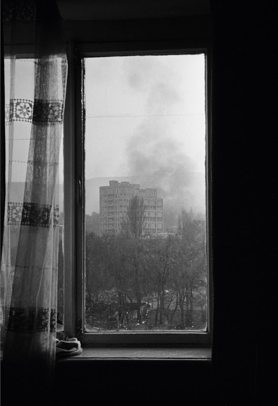
To start, I looked at windows on a very micro scale. I photographed out of the main windows in my house, changing the focus as i did so to experiment what a window photo can include.
|
|
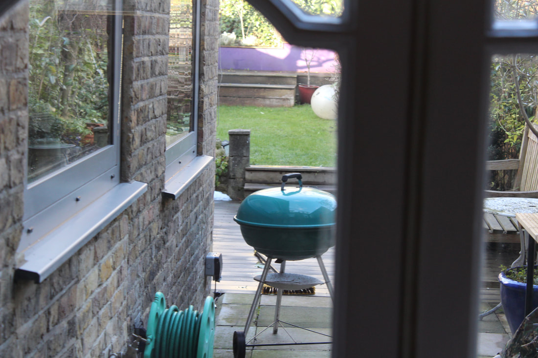
|
|
|
|
After taking these images out my windows, it made me really question what a window is and how it works. This really led me to question what are the limits of a window and how they can be shown through a photograph. The change in focus really highlights this.
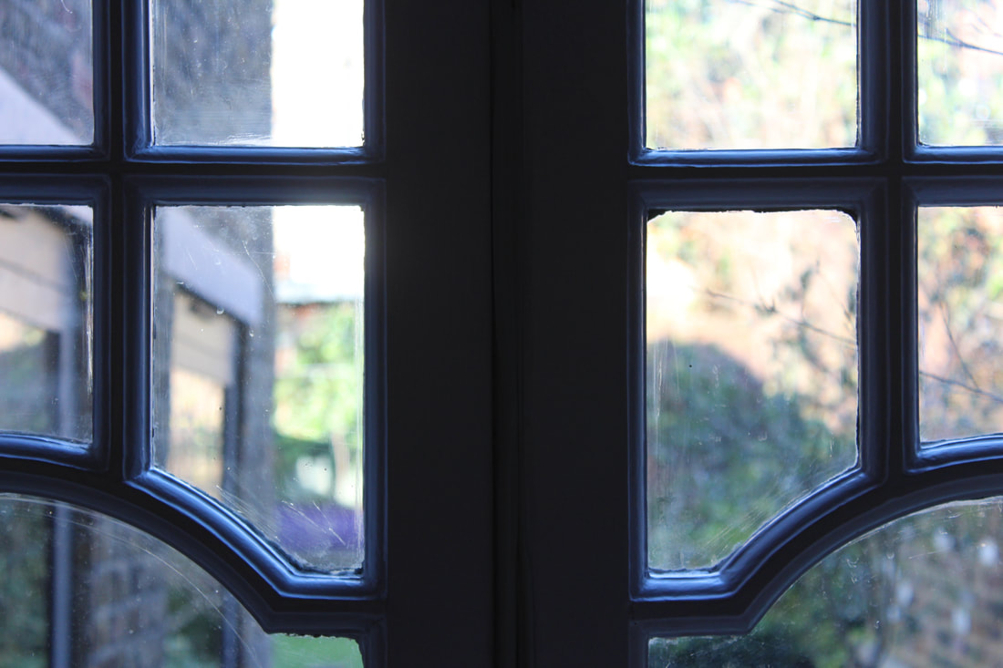
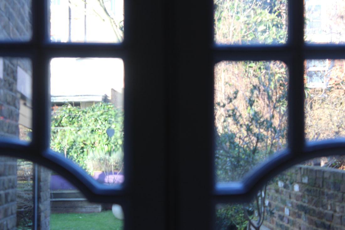
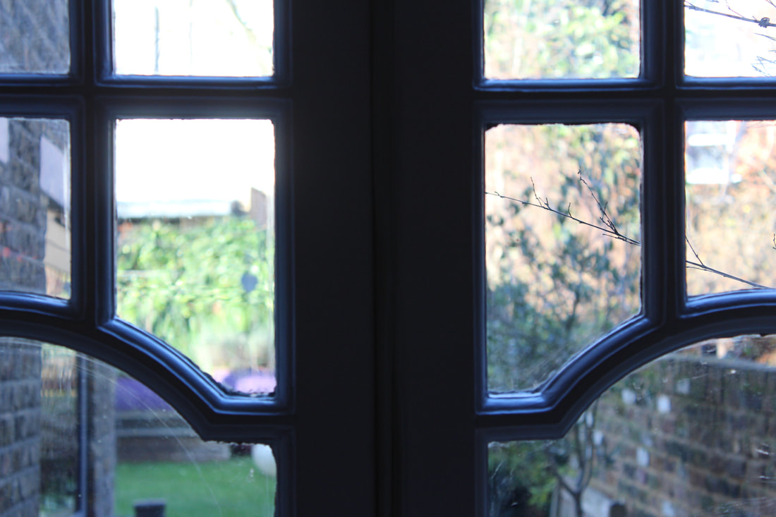
Inside out
As mentioned by Mr Twit earlier, a window has multiple purposes, looking in and looking out. To understand this and the freedom and limits of a window, I decided to photograph more of my own to understand them to a greater extent.
The first image below shows the view from my window. This view is very limited and I have attempted to show this through the framing of the image, not only through the window panes but also the cameras frame as well which further restricts the viewing angles.
To follow is the reverse angle, looking inward from the street. This view is once again restricted and nothing is visible of the inside.
What about a house without such windows? What if there was no looking inward or out?
|
|
|
Below sits the edit of my house without the window. This Photoshop edit was certainly an interesting way of producing such an image but the finished product i am not too certain about. The leftover window certainly appears in an interesting way but adds to the idea that a window should be present.
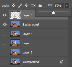
To show the distinction between window and no window, i decided to create a 'GIF' out of my edit of the building. I am quite familiar with this process but will show my steps below.
|
To begin, I selected the layer which contained the window and duplicated it 4 times. This left me with 5 different layers of window. I did the same with the background
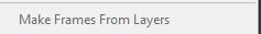
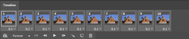
With each of the different layer containing just the window, I changed the level of fill of the image. This helped me gain the idea of the window fading and providing the viewer the sense of its presence vs without. I then merged all the layers and was left with 5 layers containing faded windows and the original edited background with no window. My next step was to use the frame animation toolbar to create a gif. As i had prepared my layers, i used the 'make frames from layers' tool to make my frames. Following this, my final step was to set the time between frames at 0.1 seconds. This allows the sense of fade to come gradually rather than instantly which was less effective. |
|

Limits of my thinking
So, if you've been reading and concentrating, you will have noticed that up this point windows have been interpreted in a very limited and physical sense. This is understandable as we are nearly all beings of sight. Perhaps its time to move on to something beyond what we see? Beyond physical objects.
Windows of opportunity
Opportunities in life find us everywhere
Perhaps an opportunity between going one way or the other
In life, many of our opportunities are limited and some given to one, but not another. Alongside this, many opportunities involve a choice. As shown above, perhaps the opportunity involves an irreversible decision or an inflexible one
|
|
Sometimes our opportunities run astray. We take them for granted and end up somewhere else.
Theft of freedom
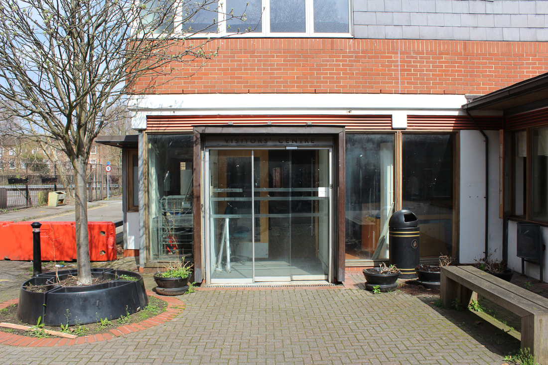
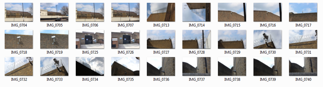
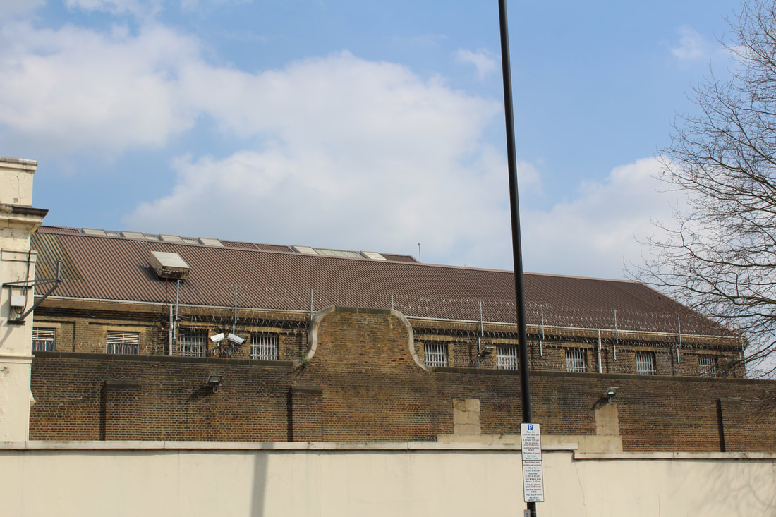
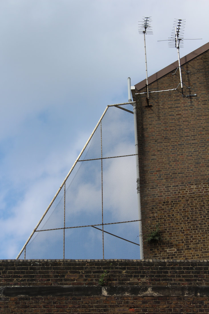
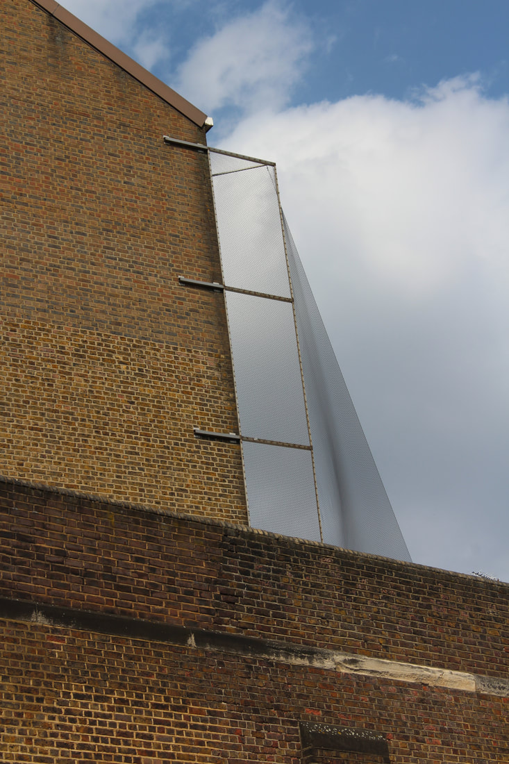
Up until this point I've explored freedom being available and decisions taken by an individual. Now I shall explore how freedom can be taken. I started with an extreme, prison. I decided to document the two nearest prisons to my accommodation - HMP Pentonville and HMP Holloway.
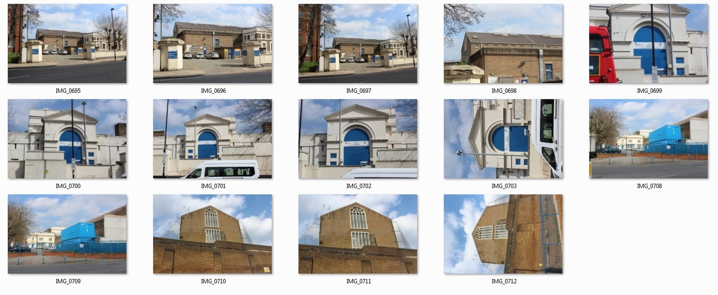
The photos above and to come will show two prisons. Pentonville and the now closed Holloway womens prison. The latter has a significant historical identity. In this prison, many of the suffragettes were present and were force fed. The concept of a prison clearly shows how ones freedoms and limitations can be taken away against their will.
Holloway Prison
Prisons are, and always will be, a very important topic to discuss. As people we should always question what our prisons are for.
Do they keep the 'harmful' away?
Are they designed for rehabilitation, or?
Should they even exist?
Do they keep the 'harmful' away?
Are they designed for rehabilitation, or?
Should they even exist?

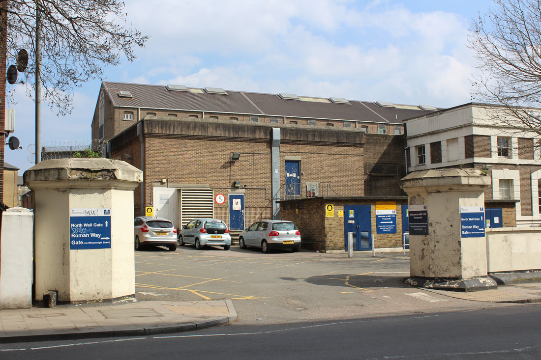
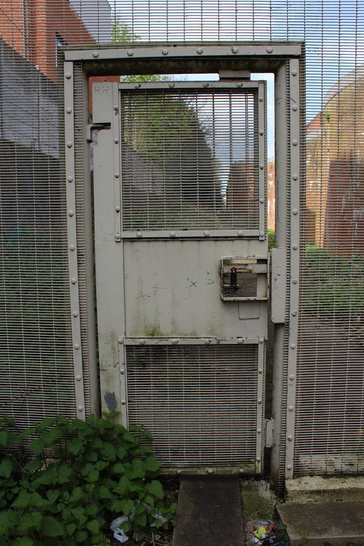
To start
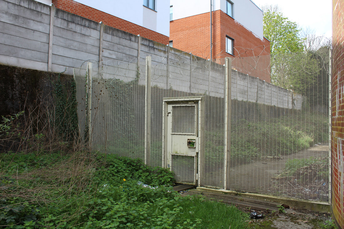
Back gate
A prison requires force
Force to keep inside in
And outside
A prison requires force
Force to keep inside in
And outside
|
|
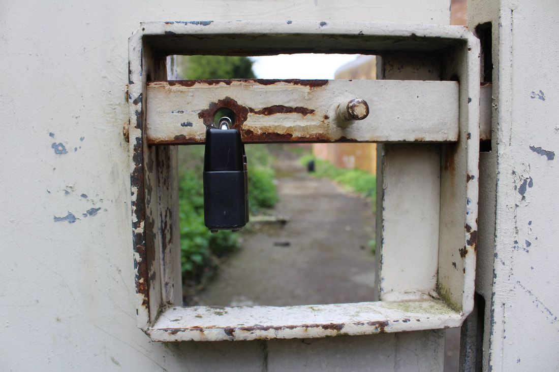
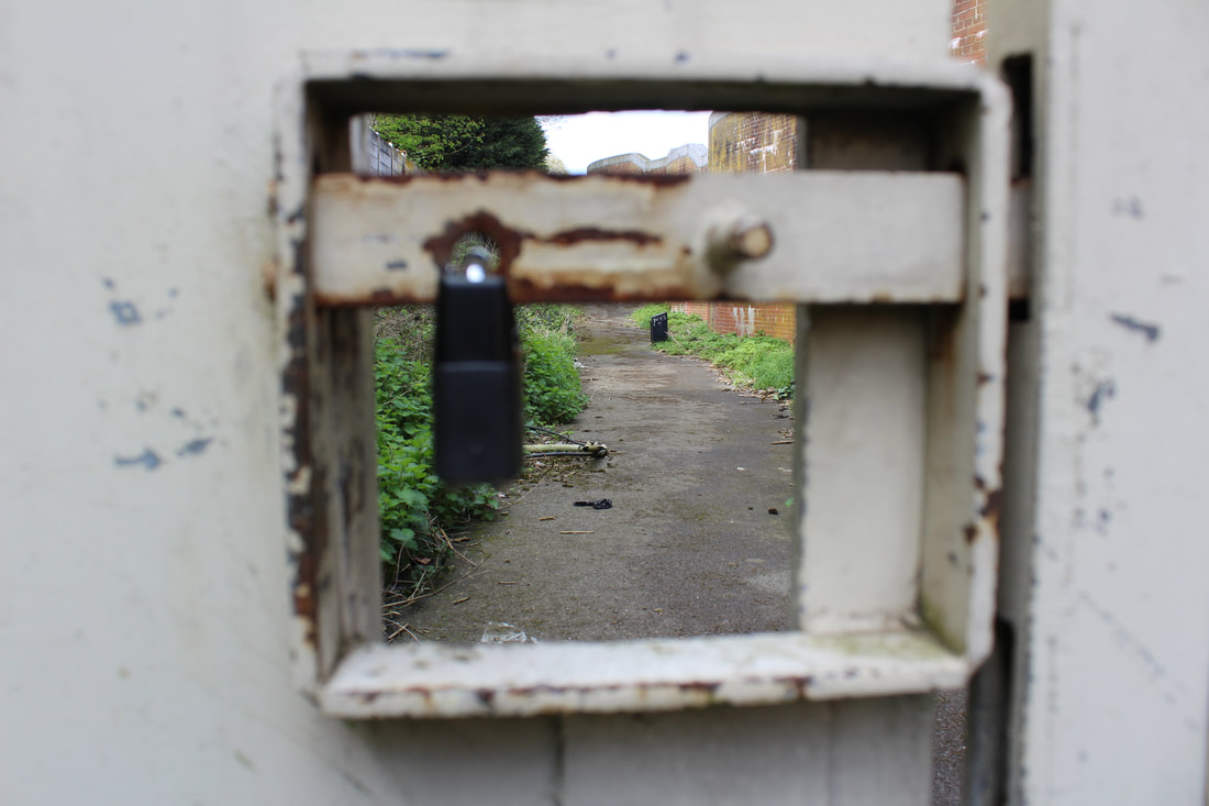
The means we use
To restrict ones freedom in a prison requires many means
I use we as everyone funds the running of prisons and on top of this we do not often argue against their existence. In the shots below i used two different focus points. The first obviously being the gate mechanism and lock, the second the path and prison inside. What one takes from these two different images is to them. To me I see the means at keeping prisoners away and the life behind those bars. The square the lock is inside acts as a small window. A window into a life with no freedom. A life with too many limits.
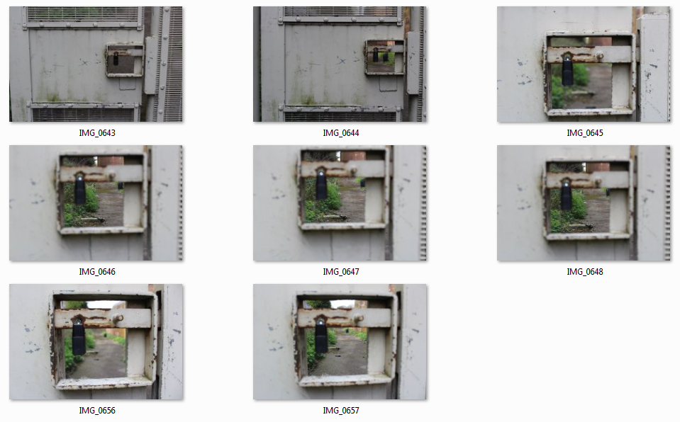
Changes in focus
|
|
Perspective
Outside HMP pentonville lies a monument for Henry Hicks. I knew nothing of this young man until researching his life.
From the Guardian https://www.theguardian.com/uk-news/2016/jun/28/london-teenager-henry-hicks-died-police-police-chase-coroner :
'Henry Hicks, 18, a carpenter from Islington, died on 19 December 2014 when he lost control of his vehicle in Wheelwright Street, north London, following a high-speed chase.'
The Police pursuing the young man were using an unmarked car.
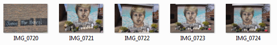
Much of my work in this Freedom and Limitations project will focus on issues that affect people. Upon learning the fate of this young man really put into perspective another life with no freedom and no limitations. This life is death.
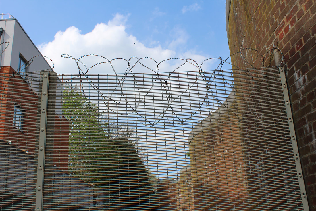
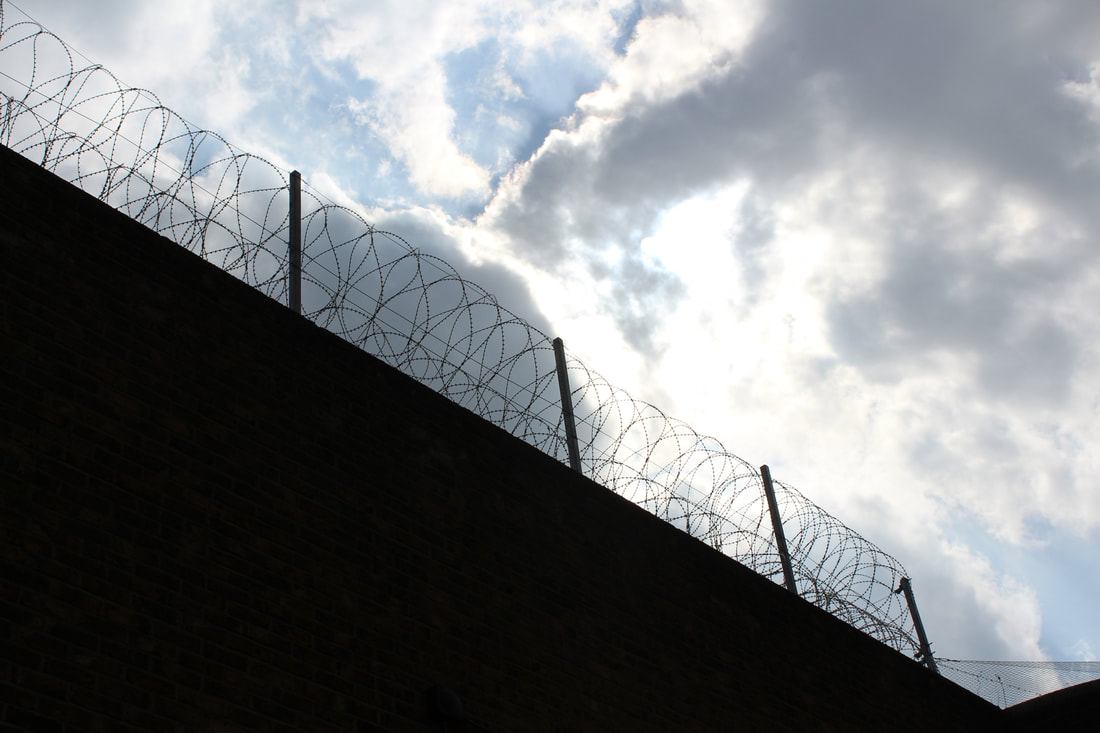
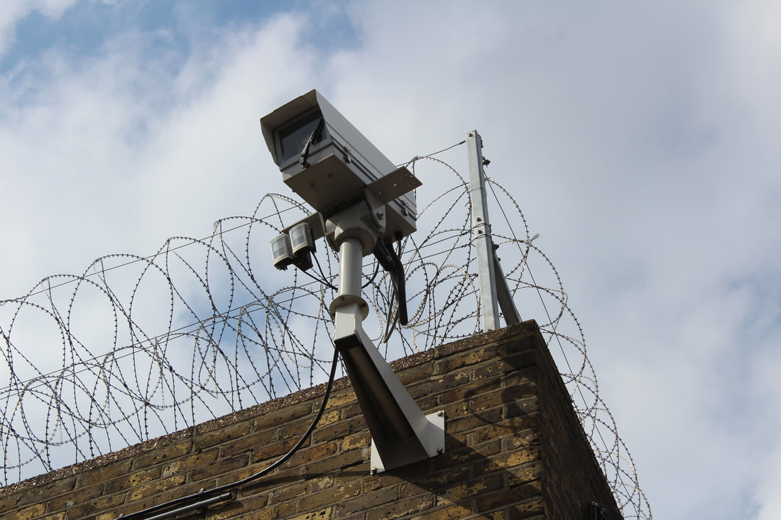
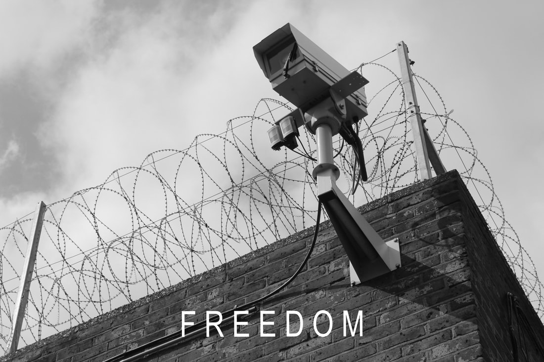
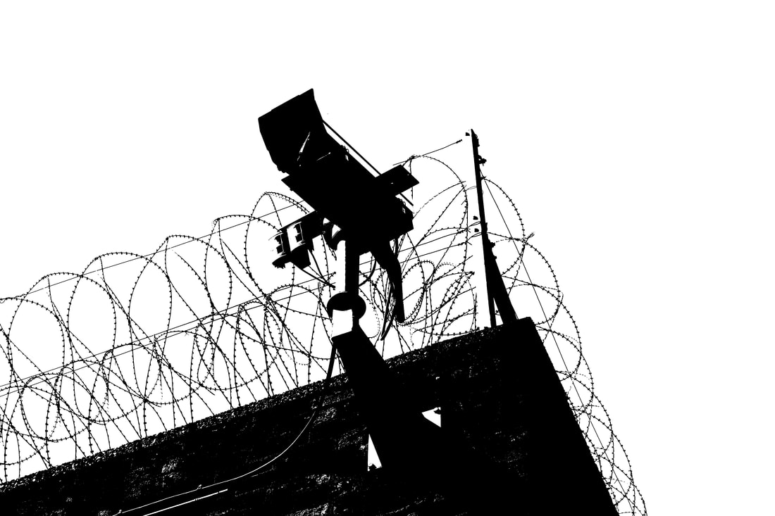
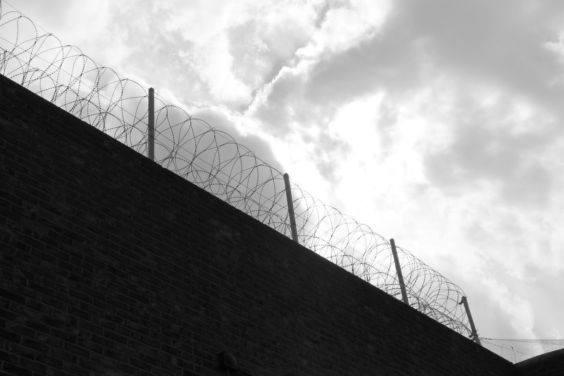
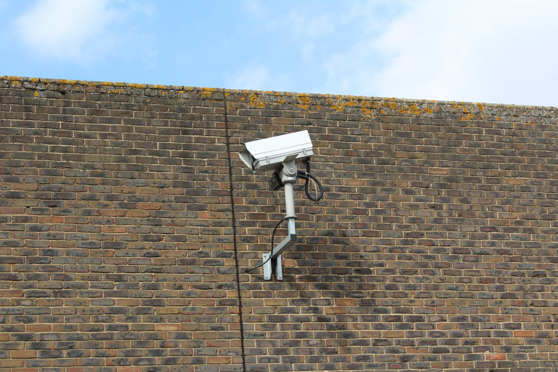
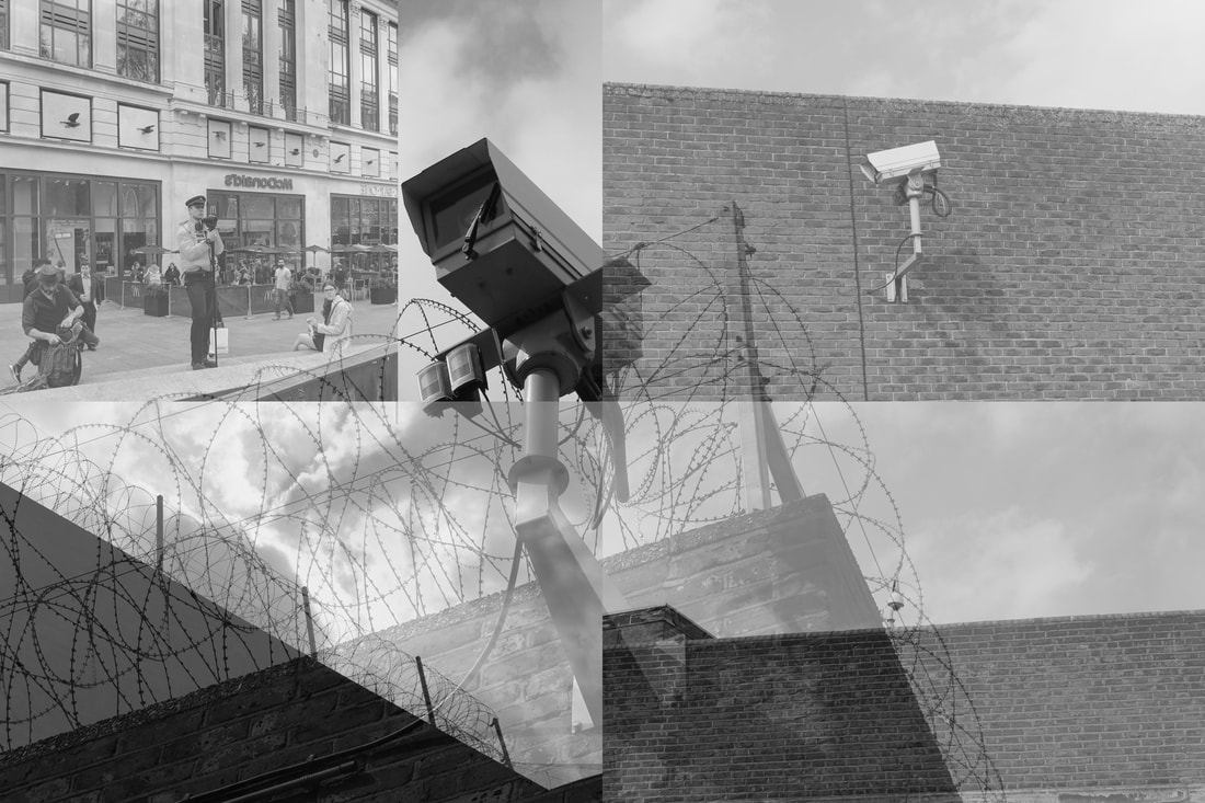
Barbed wires and cameras
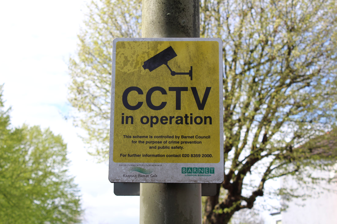
Returning to the topic of prison and the means used to take away individuals freedoms, I photographed images of some of the tools used to do so. Two favourites of the justice system: CCTV and barbed wire.
|
|
Edits
The image below takes inspiration from the work of Willie Doherty. Doherty took a series of photographs in Northern Ireland titled 'Border'. Here he explores the ideas surrounding borders and how individuals live. I wish to do similar work with my prison photographs.
|
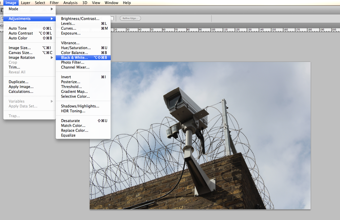
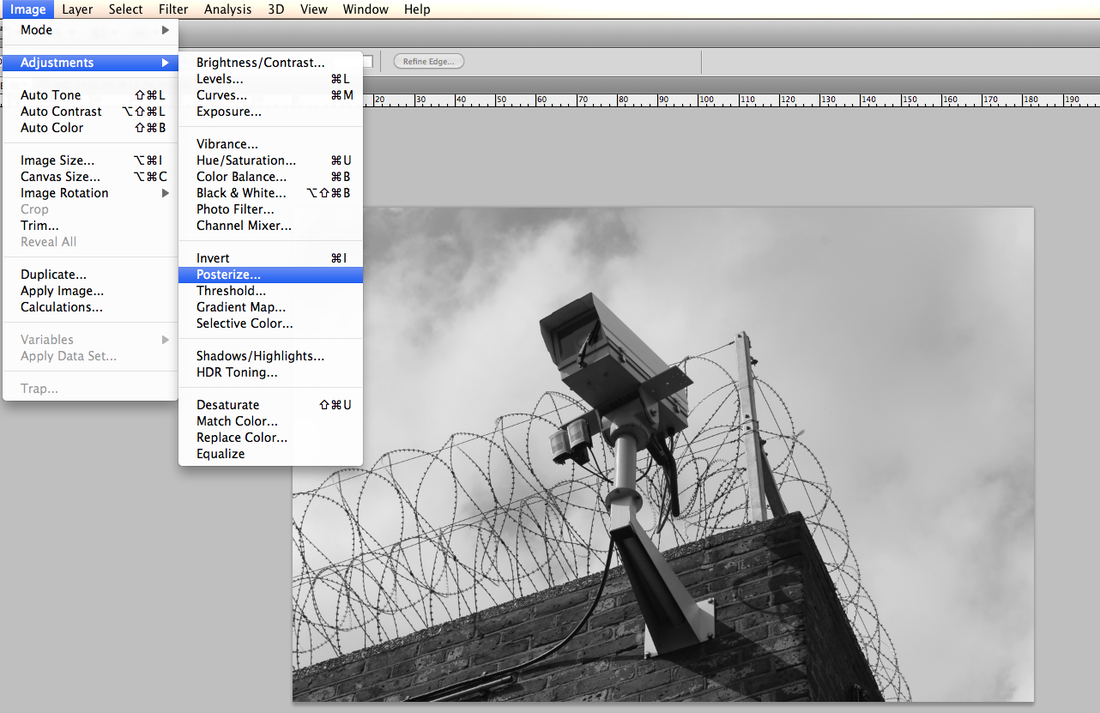
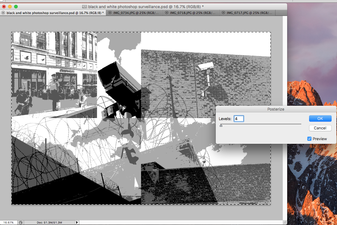
I decided to further edit the image shown above. I removed the text on the photoshop file and began to change the image.
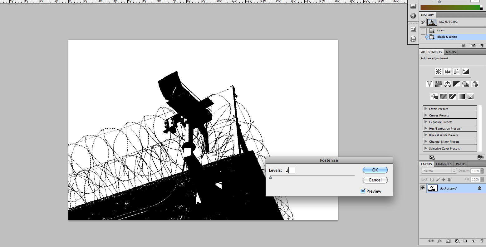
My first step was to remove colour from the image and make it black and white Next I used the posterize feature on my image. I set the effect to 3 levels. I decided that 2 levels removed to much of the image and its detail. The final step was to change the levels of the image. However, due to the extent of the posterization i did not need to use this feature. |
|
The final image shown below is heavily different from that which was originally taken. All showings of colour are gone and as is the sky. Despite the camera being the main subject of the image, it has lost much of it's detail and the wiring is now much more heavily visible.
I like the general style of the image above. However going forward I think I won't be developing the style shown above. I attempted the same process once more below. The result was not as positive and am not pleased with such image. For the purpose of showing development, i have kept it on here.
The image below was made using just the black and white filter.
The image below was made using just the black and white filter.
Freedom in another world
I've explored ideas about windows and their limits in life. The idea of freedom is yet to be explored in depth in this segment. My next idea came from our everyday lives and something that has been present in mainstream news headlines at the moment.
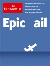
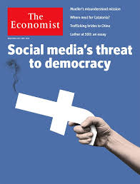
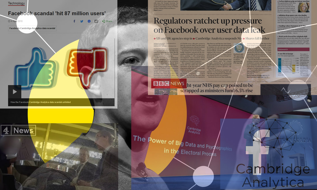
I've taken inspiration for this next area of work from somewhere unexpected. News cartoons and headlines. I read the economist magazine every week. In recent weeks there has been focus upon Facebook and its CEO Mark Zuckerberg for their actions. The manipulation of logos of such big enterprises is very powerful. Going forward i plan to use Facebook and potentially other networks to explore our freedoms on the internet and whether they are kept as we would like.
|
|
|
Below sits a small collage i created to show off the recent scandals that have taken place. Although none of these images are of my own creation, i put them together on Photoshop.
Perhaps this collage of images style will be something that I will take forward? |
|
I decided not to develop this area of my project. This is due to the limitations of recording morally wrong practices performed by social media websites and apps. I think this is a very interesting area however, so I will pursuing it in the form of surveillance on the individual and how that might affect their freedom in life.
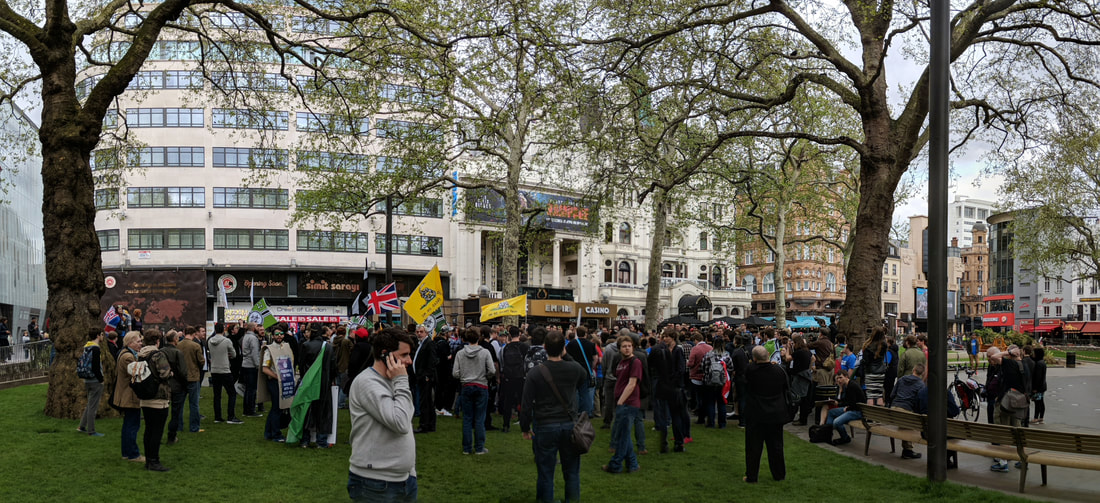
Free Speech
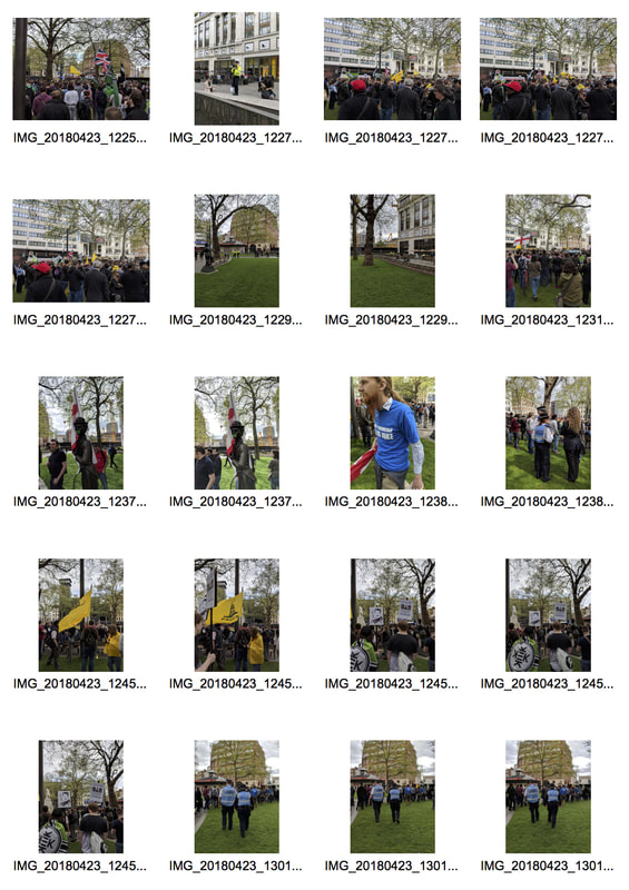
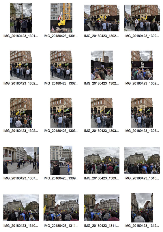
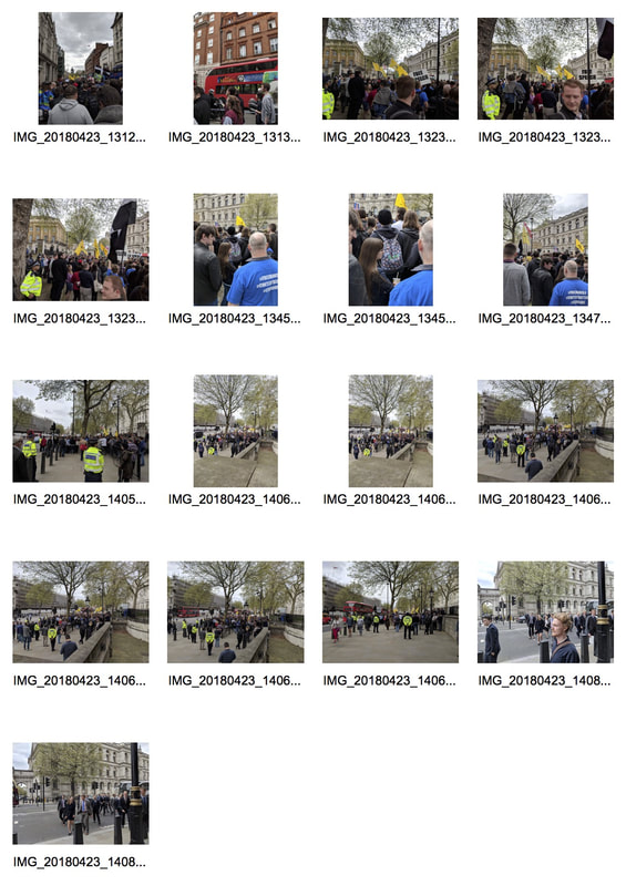
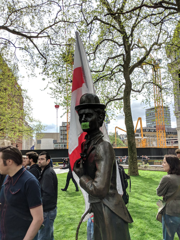
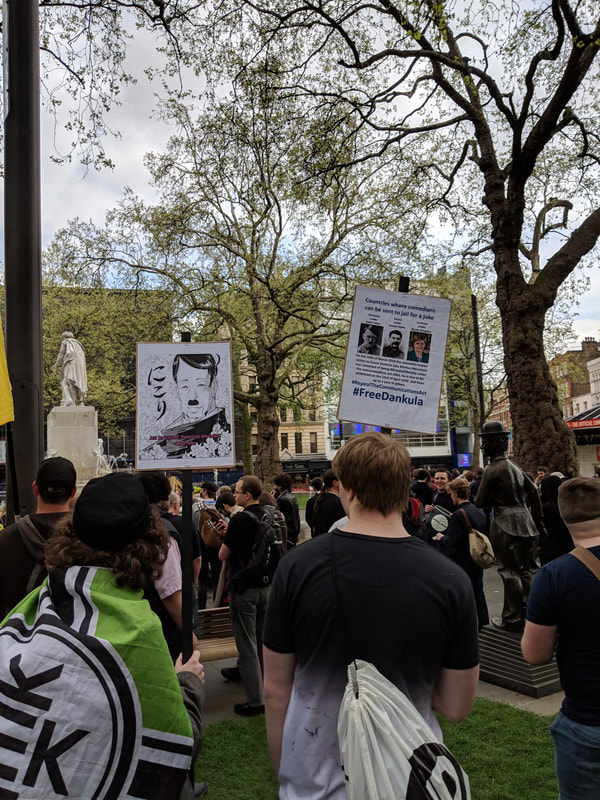
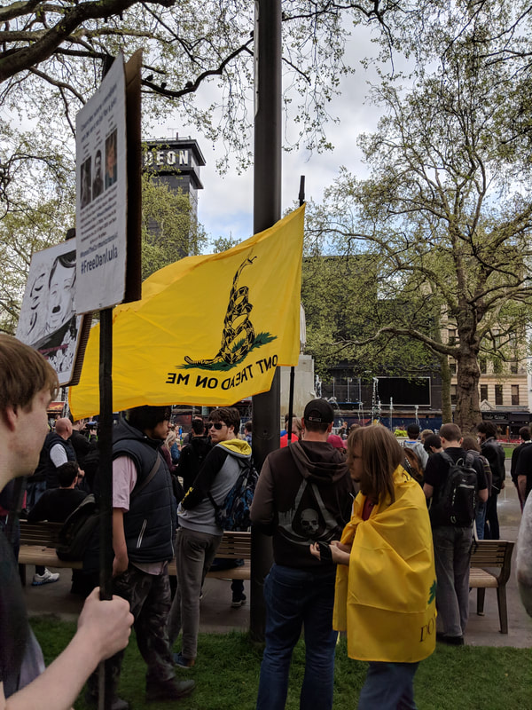
On the 23rd April, I attended a free speech protest in support of the YouTuber 'Count Dankula' in central London. Count Dankula created a slightly insensitive video in which he trained a dog to do the 'sieg heil' after he said 'gas the jews'. Although I do not find this joke amusing or in good taste, I do not believe that it warrants his arrest and his prosecution. He faced up to a year in prison due to his actions but was issued an £800 fine. I believe this to be wrong. For what I think is such an important issue in society and especially at the moment, it was very disappointing to see such a small number of people supporting our freedom of expression.
|
|
|
|
|
|
As shown below, maybe 500 people turned up but a larger number would have been more effective. The protest did not make any mainstream news headlines. This topic fits in perfectly along with my theme of looking into how our freedom is taken by the state through the means of criminal sentencing and prison time.
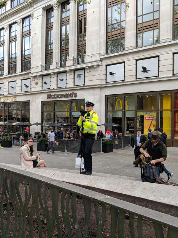
Surveillance
In the past 30 years, CCTV has come to dominate much of public life. Cameras fill schools, roads and parks. The debate for such cameras entails phrases such as 'nothing to hide, nothing to fear'. However true this may be, does the individual deserve to have such levels of surveillance upon them without being guilty of committing any crimes.
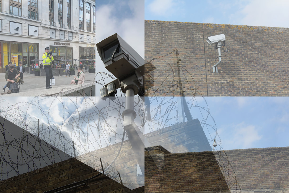
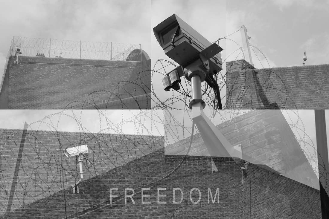
To highlight surveillance in society today, i opted to use similar methods as i used with the brief exploration of facebeook and its doings: photo montage. The first step to doing so involved selecting the images for the process. I chose the background as the image used previously for the 'FREEDOM' image. I also used the image that is in black and white above of the barbed wires, this and the freedom camera have not been included below to show off what images are used.
|
|
|
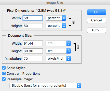
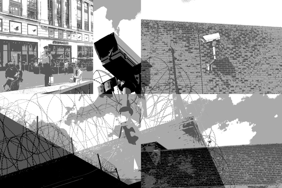
My first step to creating my first montage of cameras was to open each of the images and reduce their sizes by 50%. This meant that one image could act as the background to the others, and on top of this the images that were reduced in size stayed in the same aspect ratio. If i had done this through the 'Free transform' method, the image might look unnatural.
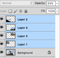
Next I copy and pasted all the different images into one new canvas with the freedom camera as the background. To reach the effect of montage or collage I changed the opacity of the 4 additional layers to 63%. This created a lovely effect of fading. Finally, I felt that the entire image had this sense of looking left. I decided the idea of looking inwards was more powerful than what was current. In response, I changed the layer in which the police officer is present by flipping him with the transform and flip horizontally. |
|
Reflecting upon the image above, I wonder if it would have been better to use the image at the bottom right as the background. This is due to the camera being a round and maybe 360 degree version, rather than those in the others which are forward or one way facing. This would have added to the idea of looking inwards in the image. I think the removal of colour from the image might be powerful also. To add a black and white filter is simple, just click black and white on the list.
|
|
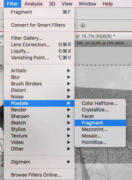
I then thought back to my previous work. The most prominent pieces being: the posterised camera and the freedom camera. The work which i was inspired by had a level of noise or pixelation in his images. I attempted to add these two things to my montage.
|
Step 1: Add black and white filter in adjustments above layers
Step 2: Combine layers by right clicking after selecting all Step 3: (for posterising) use the Image -> Adjustments -> Posterise tool to create a poster like effect Step 4: (for Pixelation) Use the Filter -> Pixelate -> Fragment tool |
|
Results from added effects
The results shown below are, i would say, alright. They aren't what i'm looking to produce. The black and white is effective, layering of images too. Something more is needed to further this work.
|
|
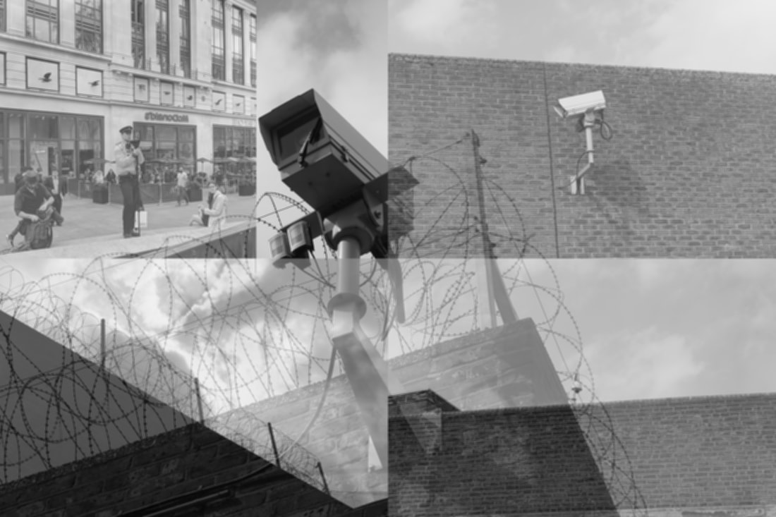
The image below was made using the exact same methods as before. The image sizing, pasting and opacity change. Once again I opted to leave the camera in the background entirely visible. This is definitely a technique i wish to bring forward with me in this segment of my development. The writing also provides new meaning for the image. Going forward I think I will explore the use of video for my project.
Who's watching you?
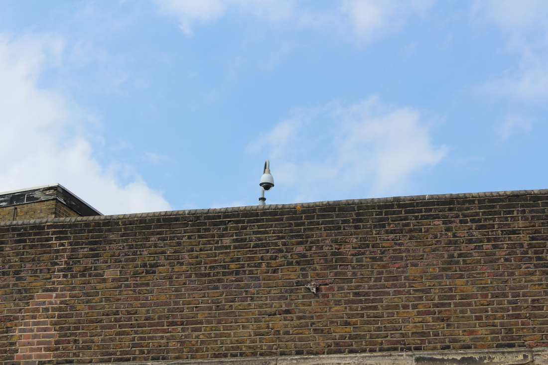
CCTV cameras. Speed cameras. Security cameras. Whatever you call them, they are cameras which record our everyday actions, often without reason. We have become so incredibly accustomed to these cameras that we hardly notice them. People walk on past, not realising the extent to which our lives are watched. How are freedom is taken away.
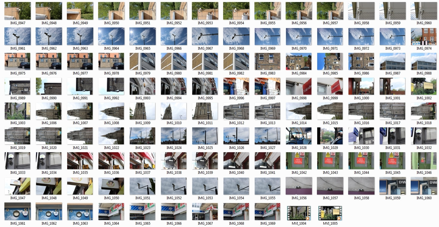
The photos below were taken as I got off the bus in Highgate and walked home. I noticed some on the way and decided to document their presence. I made the decision to walk home and was surprised by the extent of how many there was. The feeling was uncomfortable to say the least. This will definitely be what my project will finish on. My final development begins.
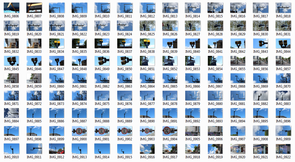
The cameras that occupy our streets blend in. They can often go unnoticed due to their placement. In the photos above and below, I attempted to photograph the cameras away from all other buildings and structures around. This gave the effect of the cameras watching over us, rather than being part of the environment.
In a 1 mile walk I counted 16 cameras.
On the buses
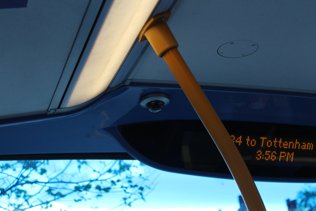
|
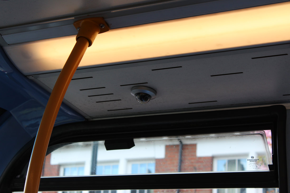
|
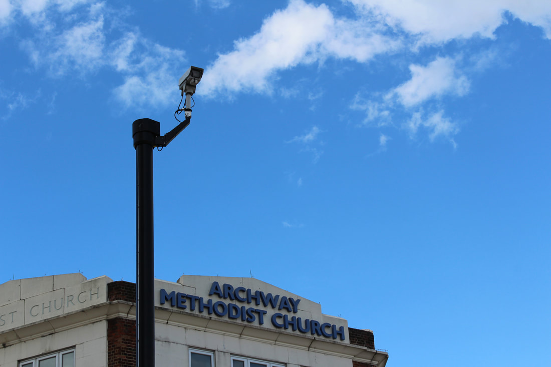
Cause & effect
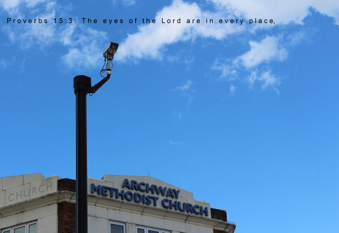
There was something about the photos of the church that really stood out. The idea of something or someone watching over us in one photo. Religion affects everyone lives everyday. Western society is so incredibly rooted in Christianity. Perhaps this is why we are able to justify such extreme surveillance of peoples lives? We have taken it upon ourselves to do the work of the God the west has to an extent abandoned. No longer are we threatened with an eternity in Hell.
|
First step was to select and use the text tool on photoshop.
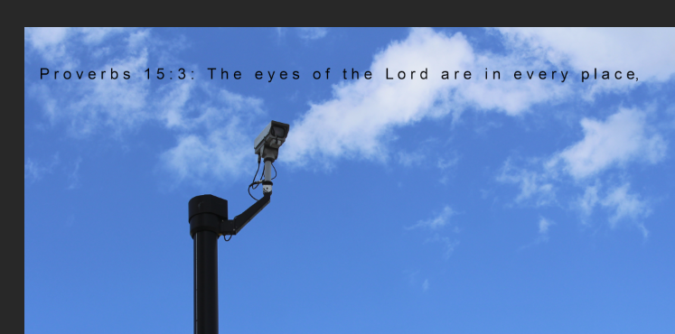
I set the font size to 102 pts. This size made the font stand out but stopped the font becoming the main subject of the image. Between each letter I added a space. This streches out the words, makes them easier to take in, rather than being condensed text like you are reading here. Sometimes I wonder if anyone actually reads any of this. If so please say something in my teacher comment. If an examiner, hope you like my work, I really put loads of time into thinking about all of this. I don't write huge amounts as this isn't about the writing. It's about the imagery, what you feel when you see my photos, what thoughts are sent round your mind. If these images make you question nothing, my work has failed. While putting in the text I had the option of where the text would be located and where it would end. A part of me thought about putting the first line slap bang in the middle but then I looked at the rest of the image. The camera is pointing to the right, as is the church. I opted to put the text above the church and camera. This creates the effect of the church, camera and text being linked together. If the text was in the centre of the image, it would become the title, rather than part of the image itself. God is often thought of this being in the sky so the text against the sky really helps add to this. I have added the image with the text centred to the right, it is clearly less effective. Although maybe its good, I will think about this. I notice that the camera is looking towards the 'eyes' which is interesting. |
|


|
Following the creation of the image above, i decided to see how the image would look using the posterize effect. I like how the image turns out but I'm not sure if this is how if its right for the finished product.
|
|
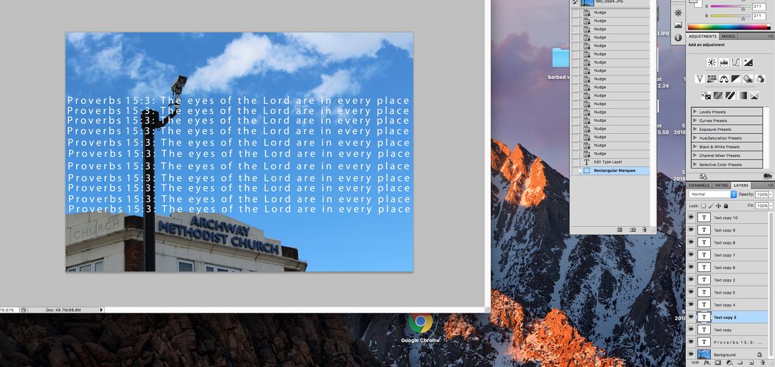
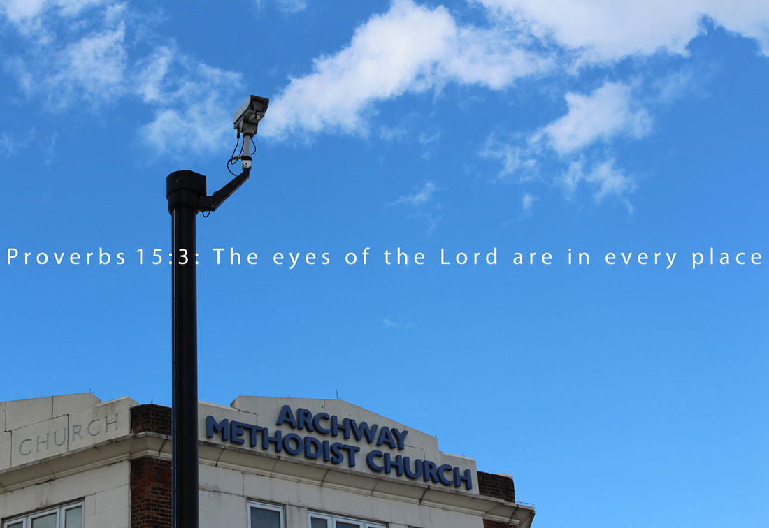
My next step was to remove the black and white, 'posterize' and second line of text. I don't see the purpose of putting in these small edit steps as I just click delete on the layer on photoshop.
Most will not notice what I'm about to highlight. I decided to leave in the comma next to place. A comma is 'a punctuation mark (,) indicating a pause between parts of a sentence or separating items in a list.' This comma connects the image and the text. As mentioned earlier, rather than the text being a title as I did with the 'Freedom' image, I used it as a part of the image itself:
'The eyes of the Lord are in every place, here they are watching you.'
Later on the day of finishing the image above i decided to revisit the image. I strongly focused upon the text. Prompting questions such as:
All of which are answered below
- Should it be centred?
- Is the font the most effective?
- How do I make the text italic/bold?
All of which are answered below
|
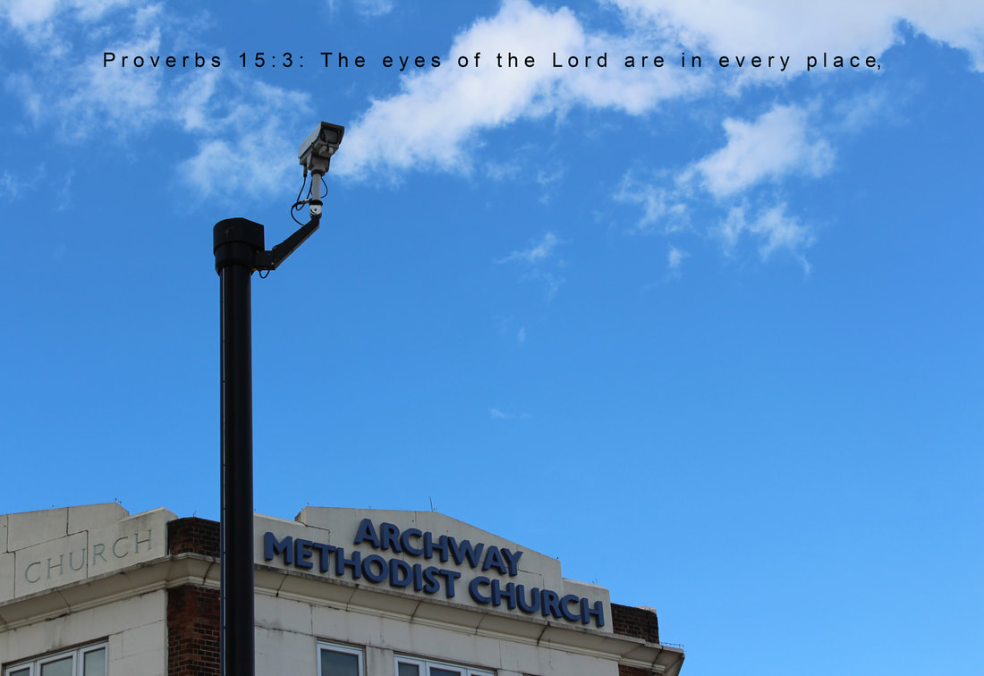
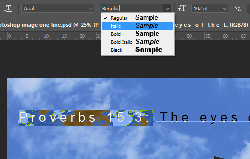
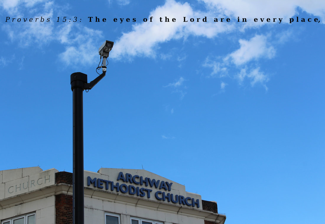
First I discovered the italic setting. I was really searching for this before and is quite hard to find. Finding it was very satisfying as the 'Proverbs' but definitely needs it. Gives it that bible effect.
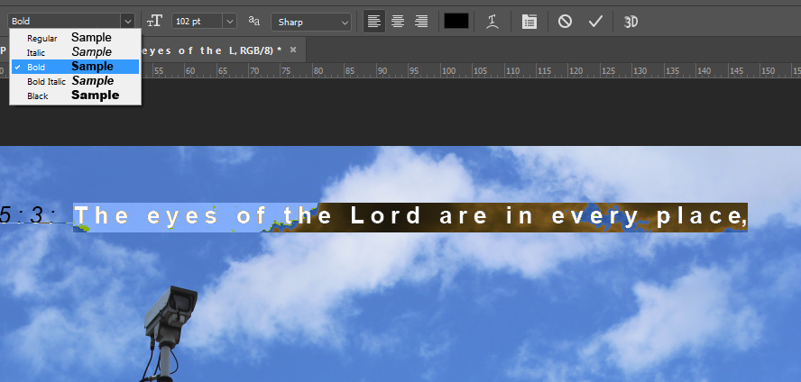
Next, I made the quote itself bold. I shall decide whether I want to keep this after this image is complete. To finish, I used the 'DejaVu Serif' font. Rest of image will be shown below. |

|
|
I decided to revisit this image. The text goes very nicely. However I think it's placement could be improved. It doesn't bring enough to the image.
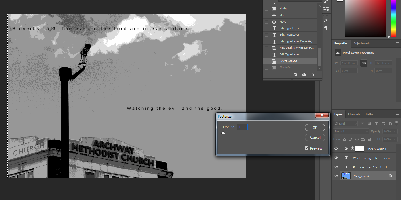
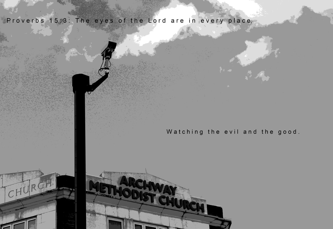
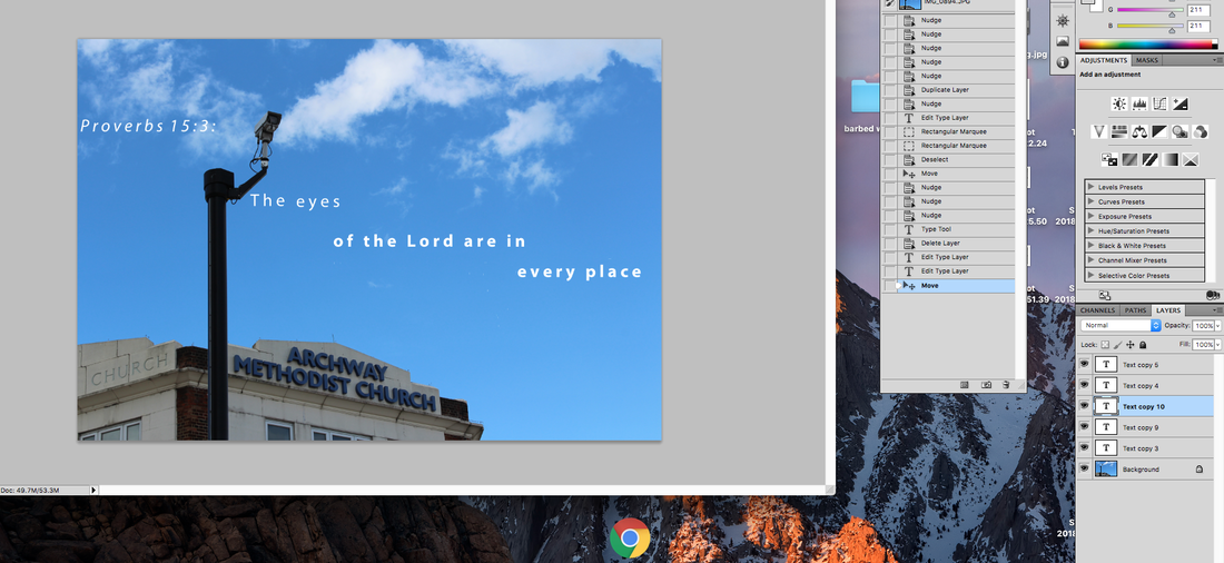
I started this by changing the text colour to white. This means that it is still visible in front of the camera pole but i can no longer have any text in front of the sky. My next step was to decide how many layers of text I wanted. Too many layers meant that it is too much for individual to take in. Humans naturally like counting up to the number 4. I opted for 4 lines of text. This means that the viewer takes more time into each piece of text and finally the image as a whole. |
|

|
I opted to make the lines of text different sizes. The biggest being the final due to it's significance toward cameras being everywhere and reducing individuals freedoms.
|
|

Full journey home
Following my walk the day before, I decided to document my entire journey home in terms of surveillance.
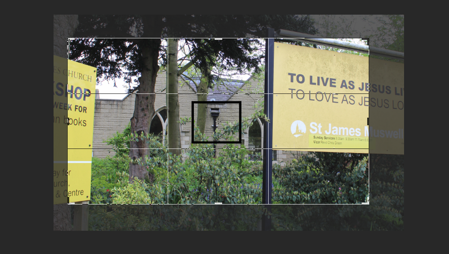
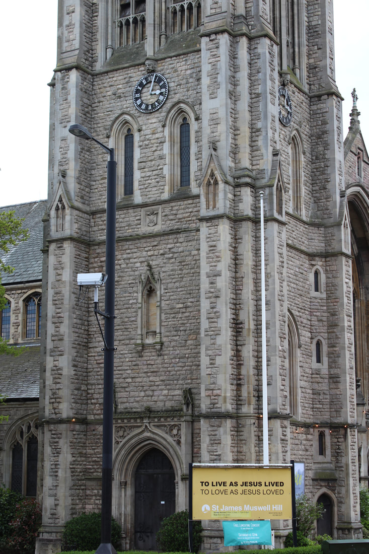
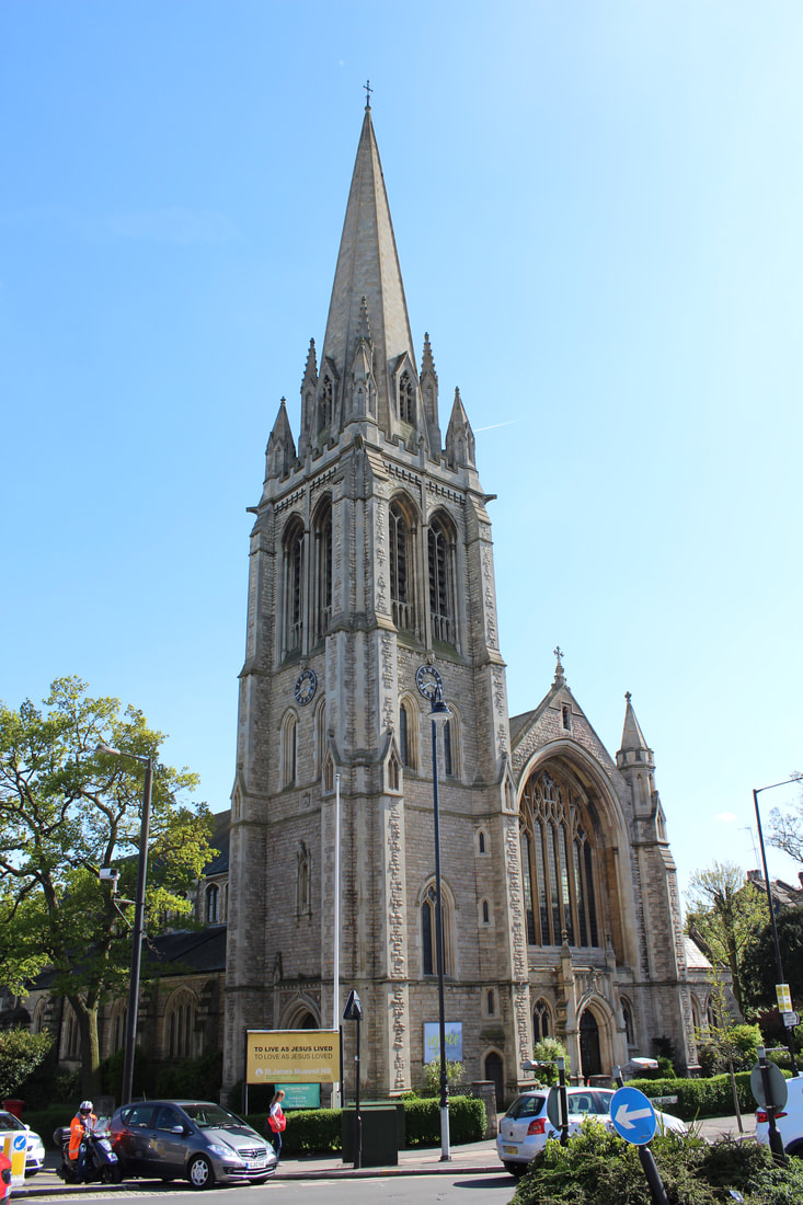
I pass another church on my journey home. St James Muswell Hill. I searched very hard for cameras but was unable to find any in the church itself. However, after photographing the outside of the church and returning home, I noticed two in the background of this image. Subtlety hidden away.
|
To highlight the presence of the cameras, I added in a box to show the area in which the cameras are present. I had this vision in my mind of a camera being zoomed in and out of but this requires video editing skills that i do not possess. However, I could create a gif out of this. Make sure to follow on.
|
|
|
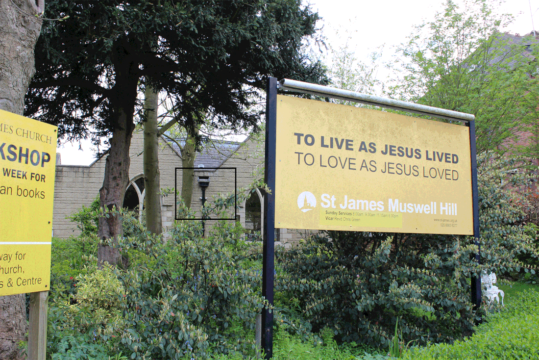
My first step was to crop the original image about 6 times, each making it smaller and zooming in on the boxed area. After cropping the image, I saved each image separately, in preparation for loading the files into a stack.
Here, I selected the images and loaded them into a stack. After doing so, I used the 'make frames from layers tool'. |
|
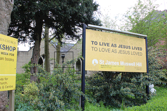
The GIF below is far too fast. I don't like how it zooms in the corner either, it's horrible. Its so bad I want to delete it but to show development it shall be kept. I changed my mind. The gif you see below is slower as the faster version was so repulsive to have on my website but imagine it was faster.
|
To create the second gif required a changing of the images in the frames. To do this I used the 'free transform' tool. I adjusted the images so that they were of the size of the canvas.
To make my gif small enough for weebly (angry) I had to sacrifice image size. Sadly this makes the images smaller and worse quality. Very sad! |
|
Below sits the final gif. I like the idea behind it, in my head it sounded wonderful but to create such a gif means sacrificing image quality. Sadly, the image quality has been significantly worsened here. Sad
Return to conventional imagery
I really enjoyed the religious imagery contrasting against the idea of surveillance impeding on ones freedom in life. I have some photos from my walk home that may help towards creating images similar to the one from before which i really liked. The image below will be main focus point for the time being.
|
|
After assessing my images of the church in Muswell Hill, I decided not to develop them further. The idea of looking into religion and surveillance is hugely appealing but in practice would not be that successful.
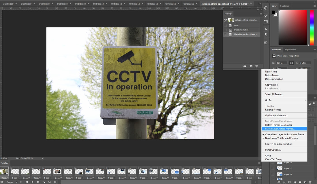
Final Collage
I'm completely unable to have my own original ideas so I'm now telling you (whoever that may be) that I took inspiration from
I decided one of my final pieces will be a collage. The title will go along the lines of 'for your own safety' or 'we are watching for your safety'. Maybe the use of they would be more powerful. Lets see how it turns out.
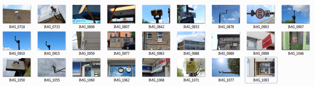
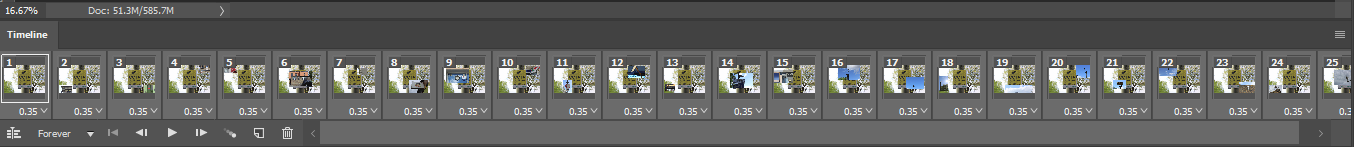
First step was to decide what images I will be using for this collage. I opted to pick all my best images of cameras up to this point. A screen grab of these images is below. I may be inclined to take more/add photos as time goes on.
|
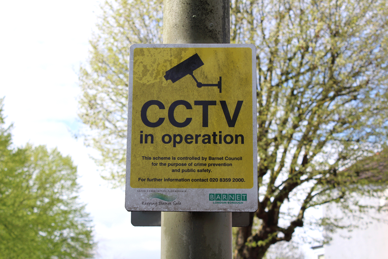
Second step: selecting a background. I selected this as it really stands out to the eye. Yellow and Black scream danger and the text combined with the camera is very obvious.
To open the images, i used the 'load files into stack option. Each image had to be individually reduced in size. The sizes varied from around 55% to 30%. The more obvious the camera in the image, the smaller the photo. |
|
|
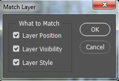
To make the background appear across each frame i clicked 'match layer across each frame'.
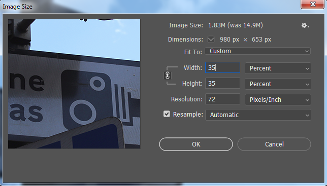
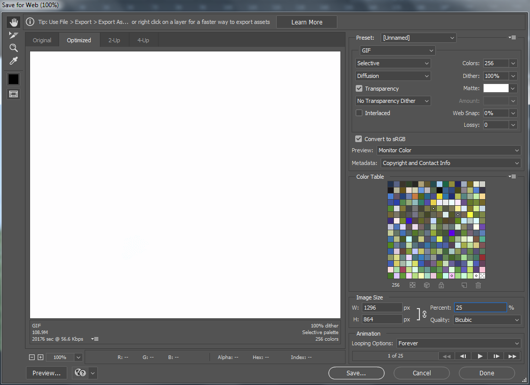
I kept each box ticked to make sure that the CCTV in operation sign was at the back of the image. I then used the 'save for web & devices'. Sadly my image was originally far too large to upload to reebly. I reduced the size of the image by 75%. This meant it could be uploaded here. |
|
Below sits the gif. I like it but a time delay is definitely required for the images to the side to allow the viewer to take in the smaller pictures.

To increase the time spent with each smaller image I selected each frame and increased the time to 0.35 seconds.
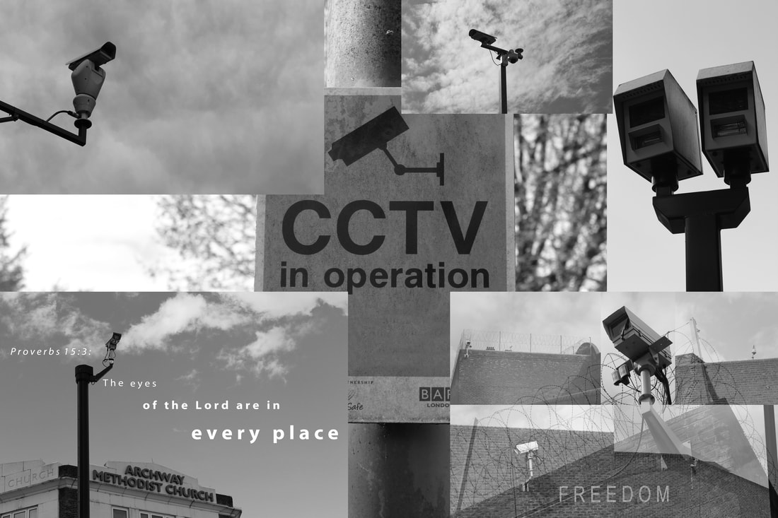
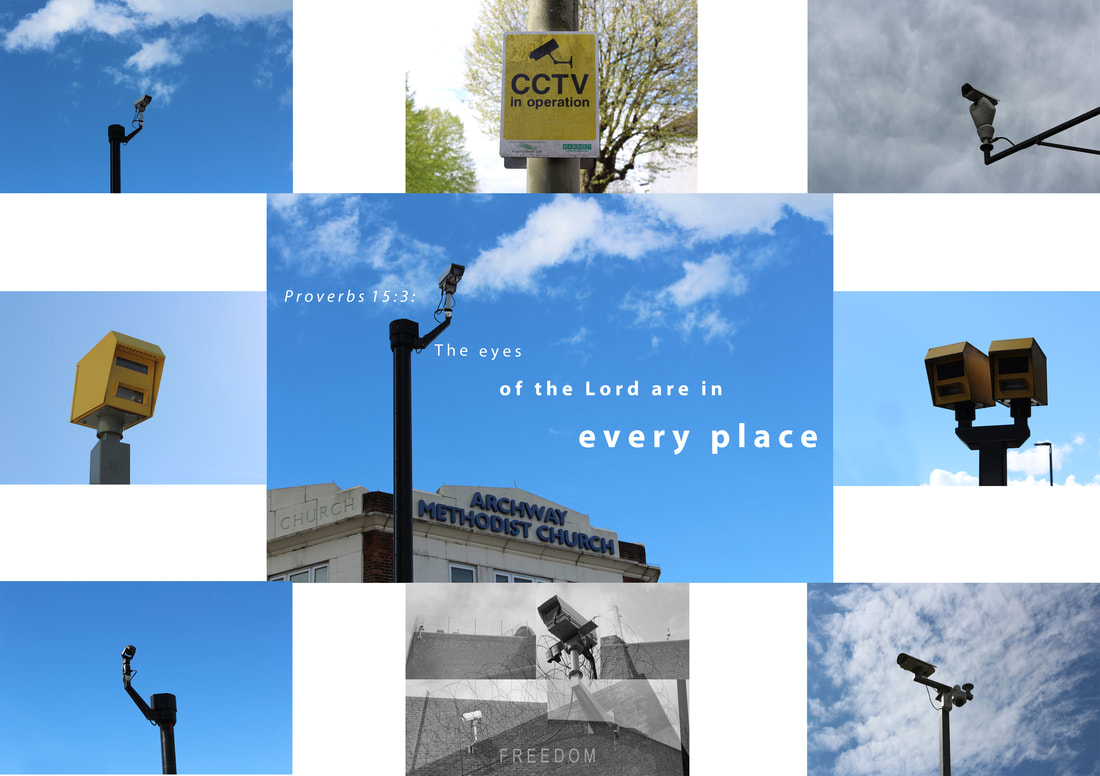
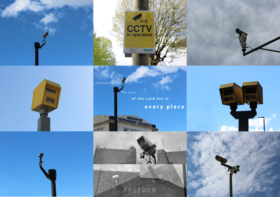
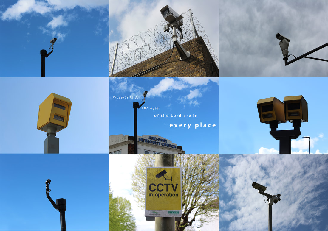
Every place
Who can do all this?
How to lay out my work:
So these photos document the process of deciding how to lay out my work following it being printed.
I decided the best way to do so was definitely through a collage. Despite this, I wasn't sure what arrangement would be best for this collage. I started by creating something along the lines of what the gif from before was made of but without the animation. I picked my best 9 photos and centred the best one (church) and put the rest around them. I decided to have the images crossing over. However, I didn't like the end result. The images crossing over ruined the others, took away from their effect.